The Ultimate Guide to Ecommerce Product Pages - Chapter4
The Ultimate Guide to
Ecommerce Product Pages
4Closing The Sale
Your product page clearly states what a great deal your product is. It shows the features, advantages, and benefits, and uses a great description to induce the desire in customers to buy. So how do we close the sale? What key elements does your product page need to complete the purchase and hopefully encourage shoppers to buy from you again?
4.1. The call to action
The most important element that encourages people to complete their purchase is known as the “call to action”, and is typically an “Add to cart” or “Buy now” button. It’s the most important conversion element on a product page and should have the greatest emphasis.
In general, the “Add to cart” button should be large and have enough contrast to stick out from the other elements. It should contain a verb such as “add” or ”buy”, and if possible, be positioned above the fold. You can highlight the importance of the “Add to cart” button or another call to action by leaving a larger than average white space around them.
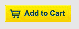
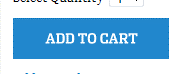
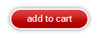
This picture shows the “Add to cart” button from three different online stores. As you can see, all of these are easily visible. You don’t need to make your button three-dimensional, many modern sites use a “flat” design style. It’s enough if the colors contrast well with the surrounding elements.
Here are some more tips for creating a call to action on your product page and on other parts of your site, such as “Click here” on a category page. These tips will help you capture your visitors' attention and spark their interest, encouraging people to click. It’s worth noting that these rules can also be applied to advertisements and banners on other sites:
- Avoid long, continuous text. Your goal is to capture attention in an instant, so keep your call to action brief and concise. For example, “LCD TVs 30% discount!” The longer the text, the less likely it is to catch someone’s attention in a moment.
- Always make everything as simple and clear as possible. If you want visitors to click, you should clearly write on the picture, “click here for details”. Tell visitors precisely what they have to do.
- Consumers generally read image captions, so it is practical to place the call to action for a photo below a photo, not above it.
- Shoppers are more likely to click on button-like elements. Higher conversion rates can be achieved by simply displaying “Details” or “Buy” as nicely designed buttons, instead of plain text links.
4.2. Product options and variants
When a product has several versions that vary only in one or two specific ways, for example, color or size, it is advised not to display them on the category page, but on the product page.
In this case, before an item can be added to the cart, certain product types or quantities must be entered, or options chosen. For a limited set of options, you can place these directly next to the call to action.
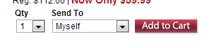
At Omaha Steaks, they place great emphasis on giving gifts, so they make it mandatory to enter the recipient of the specific product along with the quantity when checking out. However, they are smart to keep the default setting “myself”. Unique approaches like this can help to draw more attention to your call to action. For the greatest effect, keep them simple.
These product options or variations are often referred to as “product variants” and may carry a different stock number, for instance T-SHRT-BLK or T-SHRT-RED, for the black and red variants of the same t-shirt. However, they are all sold on one product page, in the previous example the product page would be for the design of the t-shirt with colors as an option.
There are several ways to display these choices depending on the options or variations of the product:
- Dropdown menu: Dropdown menus are used if the option can be described in text and identifies the product. This is especially helpful when the option cannot be properly described with images, for instance, sizes.
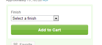
A simple dropdown menu is used in this Etsy store, allowing shoppers to choose from different finishes available.
- Image selector: Often, it’s hard to describe or give a “feel” for something, such as a color. Even a color may have several versions and not all can be described with words. Additionally, if a product has more than 10 color versions, we have to see them to be able to make a selection.
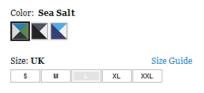
You can see an example of this on the Columbia Sportswear site, where color combinations are shown in small graphics. The only problem here is that the site does not indicate visually that the options must be chosen before adding the product to the cart. Many sites disable the “Add to cart” button until required options are selected.
- List selector: Sometimes neither the dropdown menu nor the image selector is acceptable. This may be because different versions have significantly different prices or options, or that there are too many product variants. In these cases, the product page receives a small “category page transplant” and, similar to the category page, lists the specific products that can be added to the cart.
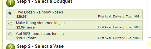
At ProFlowers you can select different size bouquets sorted in a list.
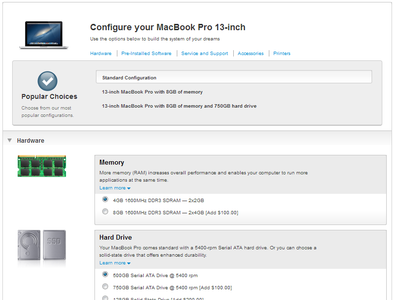
Apple's configurator is one of the nicest examples of this, where different product options can be defined by selecting features from a list.
By making it easy to select different options on the product page, you help you customers find the product that most closely meets their needs. In the example of more complex configurators, your customers can get exactly what they need.
4.3. Avoid uncertainties
A product page should contain enough information to complete a sale without a visitor browsing the rest of your site. A common mistake is assuming your visitors have already visited your home page and read all the information there or reviewed all the purchase conditions.
Your product page must be a “one-stop shop”. It must sell the product by itself and it must be able to answer your visitors’ questions. The questions that come up here can be classified into three categories, page, product, and service questions. Here are some examples:
1. Page: With short snappy descriptions that induce desire, some visitors might wonder, what exactly does the description mean? What do certain icons on the page represent? Does the small wave indicate it is waterproof or not waterproof?
2. Product: Is the sweater available only in orange, or in all the colors on the pictures? Will size “L” be a perfect fit for me?
Your goal is to keep the customer on your product page and complete the sale. You want to answer as many questions as possible. This can be achieved by having the information directly on the product page or in a separate text block, using a tab layout, for example.
Other options include having this information accessible in a bubble that appears when hovering over the text or in a small popup.
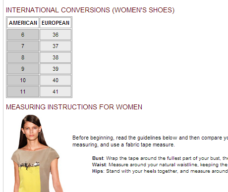
Neiman Marcus offers a wide range of clothes, and they provide a thorough, comprehensive size selector where every target group can find size tables for themselves and additional information on measurements.
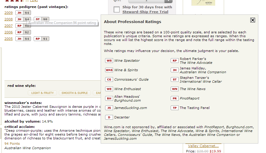
Navigation of the basic product information on Wine.com displays pop-up menus with their meanings. Clicking them displays more detailed explanations.
3. Service: When exactly do I receive my product? What does “For order” mean? What other costs are there? What exactly does one year extended warranty mean? How can I pay for it? Will it spoil before arrival? Will you handle my order discreetly? Questions like these and many more will always arise.
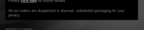
The erotic website AnnSummers.com indicates that the customer receives the product in discreet packaging that does not reveal the contents.
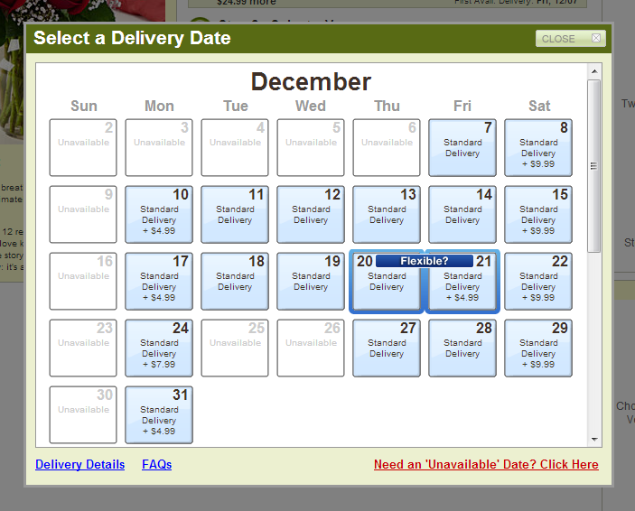
In the case of ProFlowers, exact shipping is extremely important. The customer can see the available home delivery dates based on shipping method.
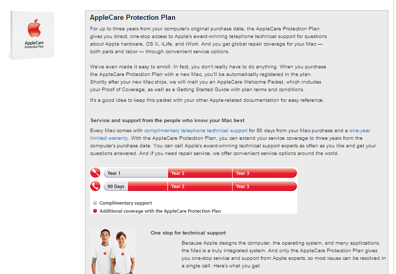
While shopping for accessories, Apple provides detailed descriptions about the specifics of the extended warranty and how it offers more than a typical warranty. Not only does it answer the questions, it also adds value to the product.
These questions can come up any time during shopping, yet most people think it is enough to answer them somewhere in a “terms and conditions” menu. Many visitors are impatient and, in most situations, will not start looking for information. Nor will they want to read a wall of text to find an answer.
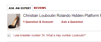
Neiman Marcus doesn’t want their visitors to get cold feet on the product page, so they provide several solutions to answer any questions that may arise. If someone has a specific question about a product, they can ask and the answers are posted on the product page.
When a visitor navigates away from your product page page, they could be two or three more clicks away from buying again. That’s why it’s important to complete the sale when you have the opportunity. Be proactive and answer any visitor questions that may come up by putting the information in an appropriate place on the product page.
4.4. Customer reviews
On the Internet, your customers can be more than just a passive receiving party — they can contribute to the success of your store. Let your customers be your voice and use customer reviews to your advantage. Customers love to hear their own opinions and they care about the opinions of others like them.
In today's “marketing noise” the customer's problem is often not the lack of information, but a glut of noisy, possibly unreliable, information. Let's face it, sellers' descriptions are often exaggerated and paint a picture of the product that is nicer than reality — and customers are aware of this.
This is why customer reviews can be extremely effective. When a person who has no stake in the success of a product or store, nor any desire to mislead anyone, provides a relevant and detailed opinion about it, this greatly increases the product's credibility. It can also play a decisive role in future customers making the purchase decision. It’s worth noting that while you may hope for all positive reviews, reviews help establish your product as more “real” and credible whether they are good or bad.
There are two main methods of rating a product that are often used simultaneously:
Written rating: This is the most basic format and the most effective way for visitors to give their opinions. It is practical to limit the minimum review length to roughly 50-100 characters. This can decrease the number of reviews, but it filters out the qualitatively meaningless "super" and "broken, not good" reviews.
Rating according to a scale: Besides the written rating, customers can also rate the product on a set scale of 1-5 or 1-10. This provides an opinion about the product that requires little interaction, is quantitative, can be averaged and displayed graphically, and which can be the basis for sorting the products on the category page. Quantitative reviews are generally displayed visually, using stars.
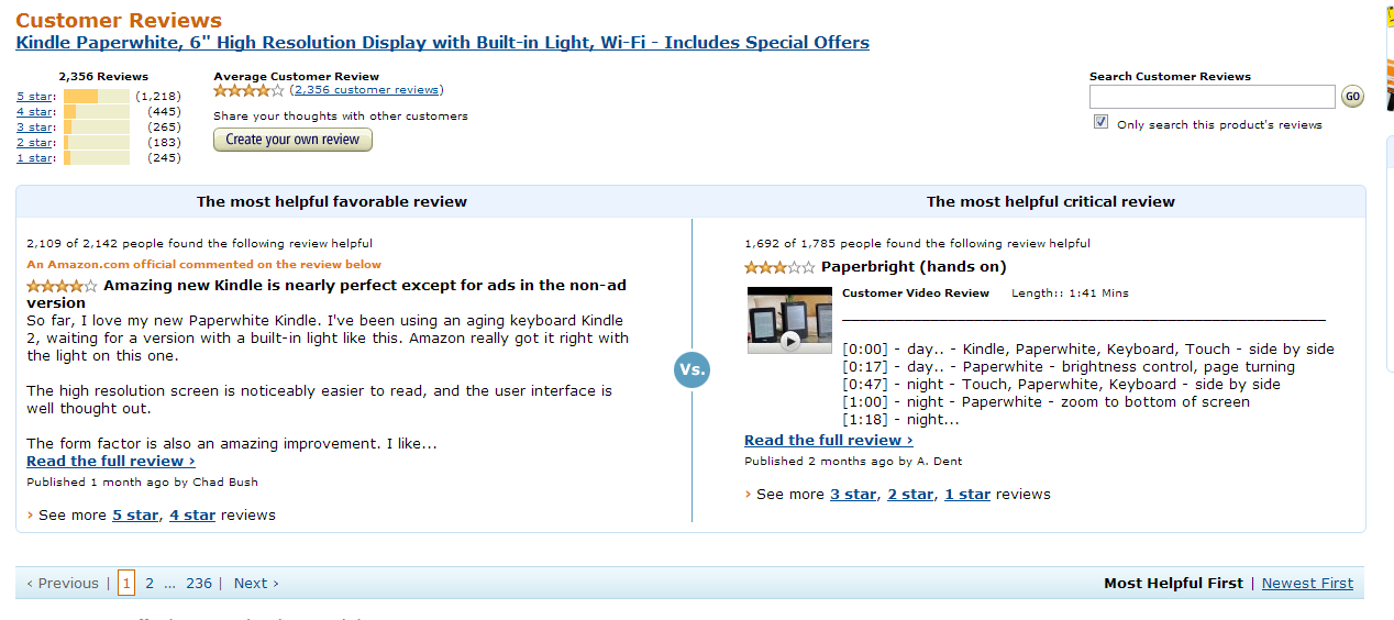
The undisputed king of collecting customer reviews is Amazon, which uses a 5-star and written rating system. It often has thousands of reviews for a product, and uses a separate content management sub-system to display them, which includes a search function, page turning, ratings, and more.
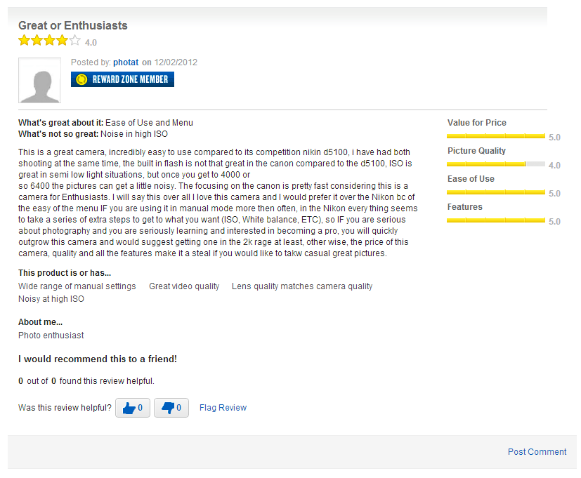
Best Buy’s ratings system asks for reviews of a product according to the following parameters: price-value ratio, image quality, ease of use, and functionality. In writing, you can emphasize what you find really good or not so good about the specific product. Displaying a few product features up front that fit the specific product is a refined solution, allowing a text rating with just a couple of clicks. Another interesting item is that the product raters can classify themselves into certain user types, so you can filter the user type's rating you are interested in. Featuring diligent, returning reviewers, and enabling the rating and commenting of certain reviews increases customer engagement.
Unfortunately, a new, little-known online store is often hard pressed to gather customer reviews. In fact, experience shows that the first few reviews are the most difficult to get, as it is often only reviews from others that encourage visitors to give their own opinions. So, it is worth encouraging visitors to write reviews by placing an insert with products that are shipped, or by sending an email following delivery of the product.
4.5. Increasing the sense of urgency
Even after desire has been induced for your products by your killer descriptions, you can’t be sure a customer will buy it. The customer may abort the purchase for some reason, only to continue it later, or not. So, it’s important to create the feeling that they must complete the purchase there and then because this opportunity may not present itself in the future.
Your customer should feel like they must make a decision right then and there. They should feel they would miss the offer unless they act quickly. You must strive to have your customer grab the offer on the spot. You can encourage this with a few simple methods.
“Countdown” for sale deadline: One of the simplest and easiest methods is creating a deadline for your sale.
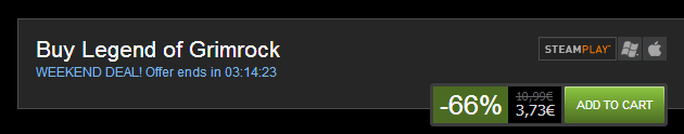
Current discount deadlines are shown on the home page of SteamPowered.com’s game store. To further increase the sense of urgency, the remaining time is indicated by a countdown on the product page when adding a game to the cart.
Sale today only! One variation of the sale deadline is when an item is only on sale for one day at a big markdown. It's a great advantage when used regularly and encourages customers to return daily looking for a sale. This can also be tied in with an email newsletter that highlights the amazing deal of the day.
Woot.com is based entirely on daily specials, communicating through their product page how a special is on for x more hours OR while supplies last.
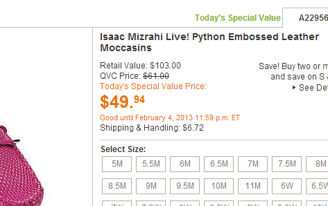
QVC had “daily deals” even before the Internet — and they have been featuring these at the QVC.com online store.
Limited-time free shipping: A short-term offer of free shipping is also a favored tool for online stores. Sometimes this is offer is extended to all products, not just one or two. This is worth trying periodically if there is no better idea for a discount.
Ship it on time! Encourage shoppers to purchase gifts in time for specific Holidays. Whether it’s Christmas, Easter, Mother's Day, or Valentine's Day, Holiday shipping is a good way to “nudge” customers.
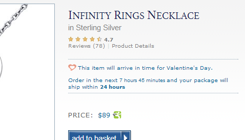
BlueNile emphasizes the usefulness of ordering as soon as possible, to ensure arrival for Valentine’s Day, on the product page for this necklace.
Limited quantities: When there is a limited supply of a particular product or when you have a limited inventory, don’t hide it, highlight it! This will encourage people to buy “before there’s no more left”.
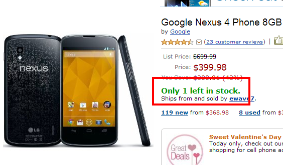
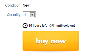
Here’s another example where Amazon clearly indicates if a product is in limited supply.
List your sold-out products: If you regularly hold deadline specials, especially of products in limited quantities, it is strongly recommended to leave out of stock items on the as a sort of warning to visitors who missed the deal, “you should hurry and buy next time!”