The Ultimate Guide to Ecommerce Product Pages - Chapter2
The Ultimate Guide to
Ecommerce Product Pages
2Building Up The Product’s Value
The product page is an essential tool for illustrating the value of the product to your customers. Our digitally savvy culture has consumers purchasing everything from snacks to couture shoes online. In order to sell either of these, it’s essential to show why your product is the right product. Help your customer switch from thinking about how expensive a product is, to how valuable and indispensable it will be in their home.
It’s an old marketing cliché that a purchasing decision is usually an emotional decision, which is justified after the fact by rational arguments. Keep this in mind when working on your product pages. Many successful online stores use this principle to great effect as they try to influence emotions more than intellect with their marketing communications and strategies.
The following sections will teach you how to create a product page that increases the value of your product in the eyes of yours visitors.
2.1. Presenting features and benefits
When you present a product, and describe its features, you can be more effective by “translating” these into the advantages and benefits for the shopper that the features will provide.
- Product features: Features can describe and identify your product. Product features and information should be detailed in list form as it allows those who know what they are looking for to find the information quickly, while also allowing those who are less knowledgeable to clearly see all the information. An example of a product feature is: 1080p Full HD (1920px X 1080px Screen Resolution).
- Advantages achievable with the features: Advantages are the abilities with which the product is empowered by its features. For example, “You can enjoy Blu-Ray movies at high-resolution in all their grandeur on the 42” 1080p Full HD LED display.”
- Benefits achievable with the advantages: These are the qualities that can make the customer buy a product. It snares a customer by showing them why a product will be good for them. For example, “You can now enjoy a home theater experience that’s just like going to the movies…only better.” Or “Enjoy the soccer world cup with your friends in high resolution, as you have never seen it before!” These examples may not be the best choice in all instances since people have learned to filter out clichéd marketing jargon. However, these examples illustrate how to describe features in terms of benefits that improve the experience for the person using the product.
Let’s consider a vase. Its color may be white (feature), which radiates cleanliness and elegance (advantage), and brings a feeling of peace to the room (benefit). It may be two feet tall (feature) so it can hold a large bouquet (advantage), and is appropriate for weddings as well (advantage). It may be made of crystal (feature), which produces light effects (advantage), and is relatively shatterproof (advantage). Similarly, you can post a picture of the product that shows its main features, or it could be shown sitting on a desk holding flowers (which also shows an advantage).
Now, let’s look a technical product, for example, a computer monitor. The screen refresh rate could be 2ms (feature), which ensures that even when the screen content changes quickly, the image does not blur (advantage), nor does the mouse cursor draw a "streak”(advantage). The result is that we can watch movies or play games with greater visual quality, thereby improving the experience (benefit).
You should communicate the advantages of owning and/or using your products in every part of your online store. Photos and product descriptions that create the desire to own your products are one of the best ways to do this.
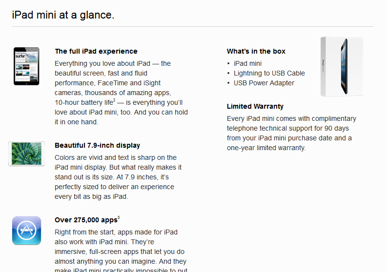
Apple does a great job of translating features into benefits that their customers can understand. They provide well-edited, desire-inducing product descriptions with pictures.
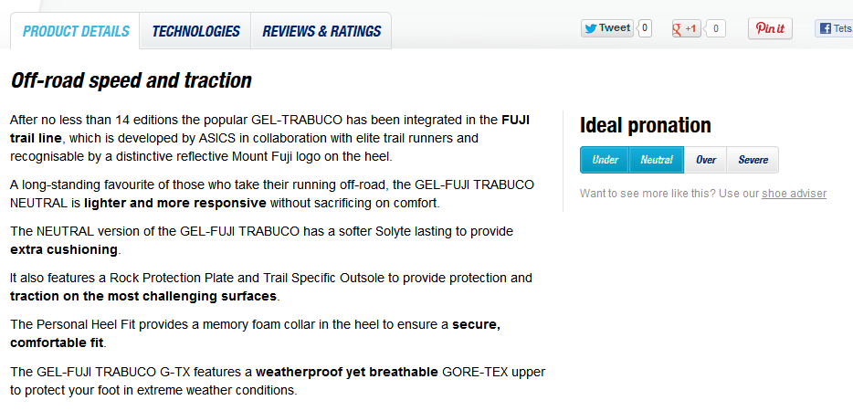
Asics features detailed descriptions about their running shoes that concentrate on the products’ advantages and their applied technologies. They emphasize the most important advantages with bold text, which is eye catching and draws attention to what Asics wants to tell the viewer.
This is especially true for technical features. Many people make the mistake of assuming that visitors to their online store are just as knowledgeable about their products as they are and that they can draw conclusions from the jungle of technical jargon and specifications. However, this is only true of a certain portion of visitors. You must “translate” this technical information into a language the rest of your visitors are comfortable with.
2.2. Writing killer product descriptions
Writing effective and attractive product descriptions is not an easy task. There are people who make a living by writing product descriptions that make you imagine yourself in that awesome leather jacket or have your mouth watering at the thought of that luscious dessert.
Although it may take some effort on your part, a short and catchy description that sparks the desire to own your product should on every product page in your store. In addition to translating “features” into “benefits” as we mentioned, here are some more tips to help you write killer product descriptions:
Know your customer: It’s important to know your customers. A shopper who is knowledgeable and professional will approach your product line differently than the average customer. And of course, there are the different demographics, such as university students or stay-at-home moms. When you use demographics and customer types to create profiles, it becomes easier to put yourself into your target group's shoes. This is also very helpful during the design of your other site elements.
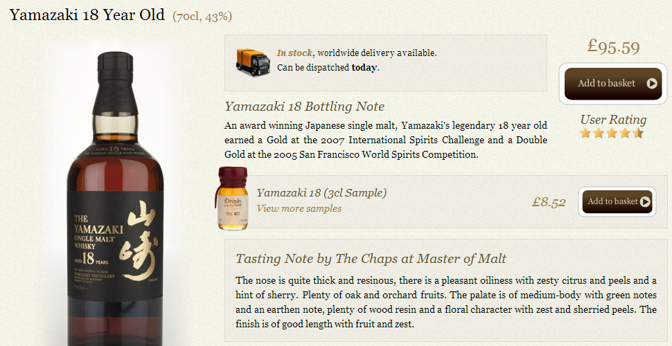
MasterofMalt.com implements these rules perfectly.
Grab your customer's attention: The best descriptions are short and to the point, and they’ve got some pop. Some customers do not finish reading product descriptions because they lack attention-grabbing keywords or phrases that draw the reader in. If you express the most attractive feature in the first few words, or start with a really effective phrase, you have a better chance to grab your customer's attention. Here is a strong description Crumpler.com:
“For those who are likely to take a few hard knocks and want an extra bit of protection, get a Hard Suit on your side. Tough and ruggedly handsome, this strongbox will protect your vitals from even the roughest handling. With this muscular minder watching your back you can get into as much trouble as you like.
So with your Hard Suit, go throw eggs at the biggest doormen you can find. They will cower like frightened cattle while you laugh maniacally.”
You get a clear description of the product benefits in an alluring description that also has a sense of humor. Well done.
Tell a story: Telling a story with your product. You can tell a story based on how the product is used, a mini case study. Or, you can tell the story of how the product was made. ProFlowers takes a unique approach and uses their testimonials to tell a story about their product and the experience of buying it:
“The recipient went crazy for it!” - David, Bainbridge Island, WA
“Wonderful. Large, juicy strawberries and fantastic icing!” - Lynne, Bristow, VA
“Fresh and tasty ... absolute masterpiece!” - Keith, Chevy Chase, MD
“I have not seen strawberries this big since I was a child!” - Jessica, Bells, TX
“They were HUGE! We were completely awestruck.” - Carline, Temecula, CA
Product description: “These unbelievable, appetizing creations are simply awesome! Each strawberry is hand-dipped in chocolate and covered in peanuts, coconut, chocolate chips or other special wickedness. The result is a heavenly combination of flavors.” - Proflowers.com
Search-engine friendly descriptions: When you know your customers, you know what they look for and you use this information in your product descriptions. A product description rich in relevant keywords will significantly improve the product's placement in search engines and help the right customer find you.
In the following example, the important keywords are highlighted. This enhances the effect on visitors who search for the terms.
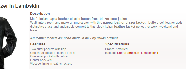
“Men's Italian nappa leather classic button front blazer coat jacket
Walk into a room and make an impression with this nappa leather blazer jacket. Buttery-soft leather adds distinctive class and undeniable comfort to this sleek Italian leather jacket perfect for work, weekend and travel. “
Pierotucci.com
Don’t get carried away: Interested customers will only read long descriptions about a product if their attention has already been piqued and if the product requires it. A short, concise description of just a few lines is what you need to grab their attention. Of course, if you have a short story about a product, you can put it out there, but it shouldn’t be what you open with.
A few negatives can help to highlight the positives: Carefully applied, this can greatly increase the hard-hitting effect of your desire-inducing description. This is more sensible when you have a range of products that provide different benefits. For instance, let’s say you emphasize that a product is the heaviest product in a given product line; however, it’s also the most durable. Contrasting benefits like this can spark stronger emotions in buyers. Of course, this is more sensible when you have a wide range of products and may carry, in the above example, a product that is less durable, but lighter.
Here are a few more things to keep in mind when writing killer product descriptions:
Avoid typos. If customers see that you do not pay attention to details, it can have a negative effect on whether they trust you.
Be honest. You’ll do better business in the long-run when you are upfront about any shortcomings of your products.
Match the description to the photos and product information. Make sure your product description uses the same tone and style as the photos and product information.
Test, and make changes. Be sure to test your descriptions to see which ones are popular and bring more conversions. If they test poorly, you can improve them.
2.3. Listing product information
Outside of your description, you can list information about your product in separate fields that typically include additional features or specifications. All product information, even the details that might interest just a small percentage of visitors, should be provided — but in the right place. As a rule of thumb, information that captures the interest of only a few people should appear lower on the page, and information that is of interest to all visitors should appear higher on the page.
Look at your product page and consider whether the information you have provided is enough for a shopper to make a purchase decision. If not, decide what additional information they need and provide this information in the best possible location.
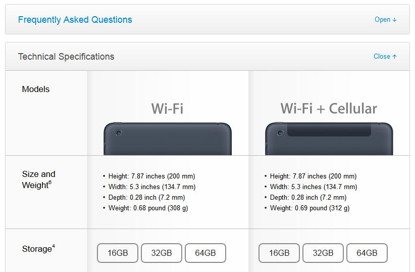
Apple provides product specifications in a dropdown box along with the information block. This provides answers to the most frequent questions in a well-structured and clear manner while keeping the presentation clean and simple for shoppers.
Featured product information: If products have specifications that are required for the “identification” of the product, or are significantly important in leading to a decision to purchase the item, then this information must be specifically emphasized. It should not be buried in the product descriptions or lists of specifications. Such information might be measurements of furniture, materials used in jewelry, or capacity for a hard drive.
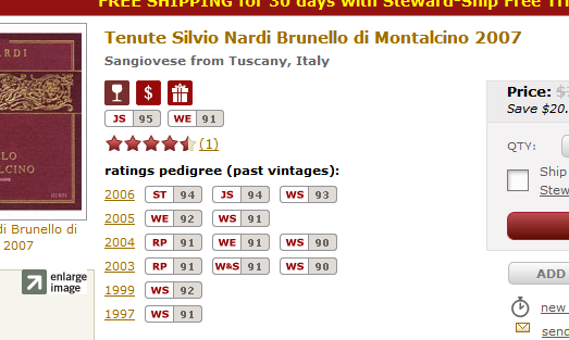
In the above picture, Wine.com lists the most important information for their product. These include the icons explaining the product's primary features, the scores from specific wine connoisseur sites, customer reviews, and the awards won in particular years.
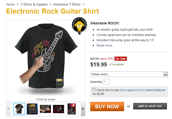
Another excellent example is this ThinkGeek product page. Based on the product name and the picture, you would not know that the guitar printed on the t-shirt actually works. However, the few lines of description immediately cast light on this, and in one swift step also remove any lingering doubt about the product while increasing the product value from the customer's perspective. In addition, the main product picture is animated. Other pictures include content uploaded by customers.
Desire-inducing product information: A general list of specifications is sufficient for determined visitors and for a small number of solution-seeking visitors, but it is not enough for browsing visitors and the majority of solution-seeking visitors. In the same way you write desire-inducing descriptions, your product information should also be written to spark the desire to own your product.
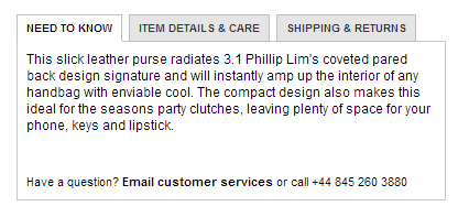
The MyWardrobe.com online store features product advantages and benefits, followed by the product features in this product information field.
Use lists: Generally speaking, product information should always be displayed in list or tabular form. A list can be read more quickly and can concisely provide the information the visitor needs. There are products (such as technology products) where a product has a lot of technical specifications, and there are products (like clothing) where there are many less.
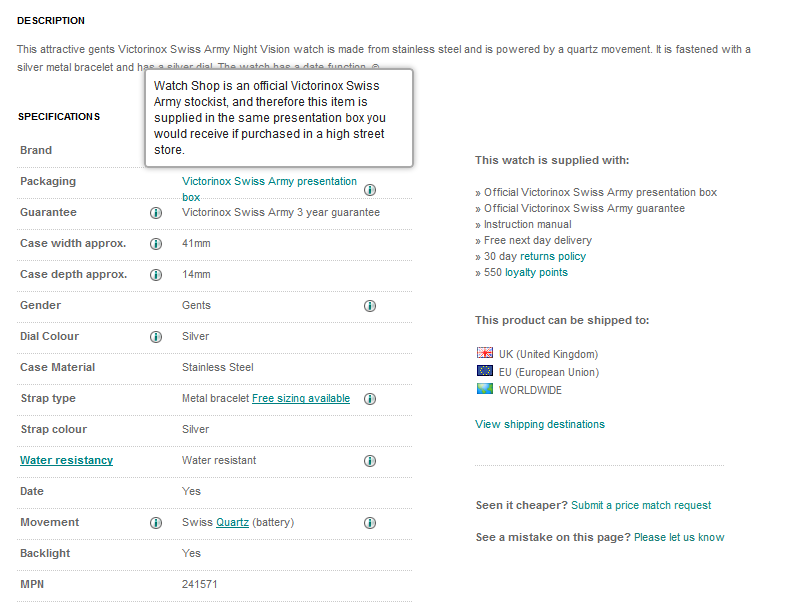
Certain watches in the Watches2U.com online store have detailed lists, including box contents and other information that is presented beside the specifications and their explanations.
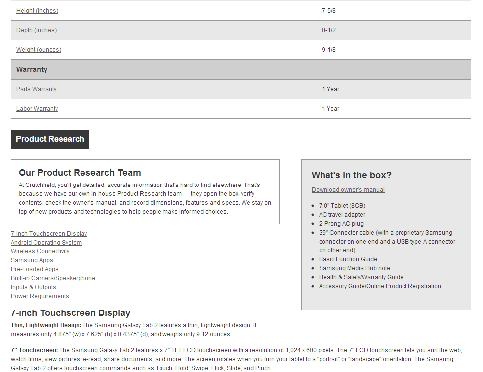
The Crutchfield online store is the uncrowned king of product information. As a technical site, they have detailed data for their products. They include not only explanations of those specifications, but also test results related to the specific product assembled by their own testing and research team. There’s even more detail on specific technologies used in their products.
2.4. Displaying stock and availability
It’s important that you monitor stock levels and correctly report them to your customers, making sure they can’t purchase an item you don’t have. It sounds silly, but even large online stores have made this mistake.
How you indicate the availability of your products, for example, “in stock” or “out of stock”, is an important part of the product page. While it’s only a small element on the page, you can use stock and availability phrases such as “only X left”, or “coming soon”, to generate more sales and interest. For products that are out of stock, but you know will be fulfilled, you can also provide “pre-order” or “sign up to be notified” options to help save the sale.
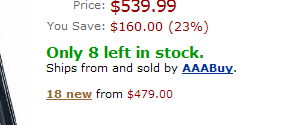
Online giant Amazon.com use the indication of inventory to increase the shopper’s feeling of urgency, by stating “only x left in stock”. If they only displayed the number, it would not suggest the feeling of “hurry, we are almost out!”
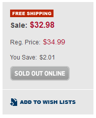
Best Buy indicates whether a product is out of stock by disabling the “Add to cart” button, but there is no way of finding out about when the product may be available again.
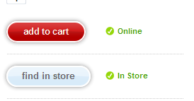
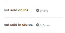
A different approach by Target indicates availability for both online and brick and mortar stores, creating a call to action for both purchasing options.
Availability is especially important for products where shortages are frequent or an item is rare and in high demand. Use this to your advantage, but always be sure you actually have the item available to sell!
2.5. Using photos effectively
The significance of a product photo depends on the product range. In some areas such as technical items or industrial products, photos are less important. In other areas such as clothing, jewelry, and flowers, your success will depend almost entirely on the product photo. In this case, a good, clear product photo is probably the most important element on the product page.
Whether or not “appearance” is something that’s important for you, it’s vital for online shoppers. Photos of your products bring them to life for your shoppers. These pictures help your customers imagine the specific product and create a desired experience in their mind. A product being sold online can’t be touched, tasted, smelled, etc., so a customer needs to see it in as much detail as possible.
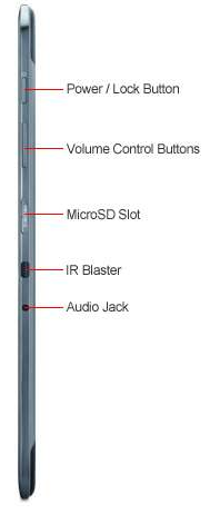
TigerDirect displays numerous pictures of their products and provides explanations for specific product functions. This calls attention to specific features of the product without the customer having to read a detailed product description.

ProFlowers makes a connection with their product photos by referencing a TV network. It’s an interesting marketing tactic that allows the shopper to personally relate to something familiar to them through the product photo. This builds trust and makes the product seem more “real”.
The photos you choose for your website should be used to identify your products and also to create or enhance the shopper’s desire to own the products.
One way to achieve this is by showing photos of your products in “live” situations where they are being used as you would use them yourself. Desire is much easier to induce for a piece of furniture, for instance, if you show it being enjoyed in a nicely furnished room.
Photos featuring people also attract more attention. The more personal the picture, the more it attracts. One or two well-placed smiling faces will get more attention for featured products.
Showing off your products in live situations is especially important for items such as clothing, where it is usually not easy to see how the item will look based on a photo showing the clothing on a hanger or folded flat.
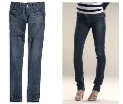
These two photos are of the same pair of jeans; the first photo shows the jeans merely laid out, the second while they are being worn. The difference is clear. Very few people can imagine how the jeans would look on them by seeing only the first image.

Both of these pictures show red roses on a flower delivery site, however there is no question about which photo creates a desire for the bouquet more effectively. The second image proves that high quality photos make an important difference too!
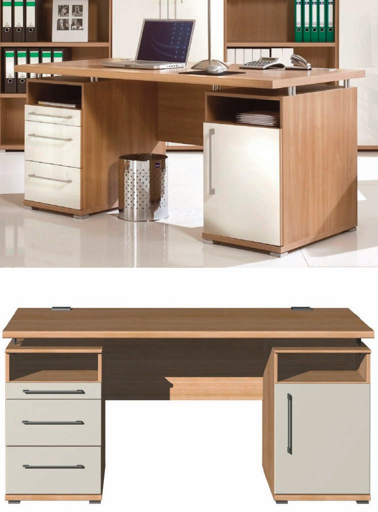
Here’s another example with two different photos of a desk. In one, the desk is in a “live” situation, while the other is on a blank background. Although you can recognize the product and its primary features in both images, the top image is more likely to encourage someone to imagine the desk in their workspace and purchase it.
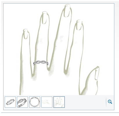
BlueNile uses demonstrative pictures of how a specific ring will look on your finger, removing any doubts about the product’s appearance.
It’s worthwhile to provide more than one view of a product, because different customers are interested in different views or features. Like product descriptions, the most important photos should be “featured” or first, with photos of the less important details later.
Taking photos from different angles also helps shoppers imagine the product. The more product pictures, the more “real” the specific product can become for the visitor, even if the additional images do not provide a lot of new information.
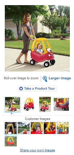
The above pictures from ToysRUs show a product during use. Note that these product photos all feature children using the toy. There are multiple photos to help make the product more “real”, and the smiling faces of the children immediately show the benefit of purchasing the toy. The added ability to upload customer photos is a masterful touch that builds trust and creates the desire to own these products.
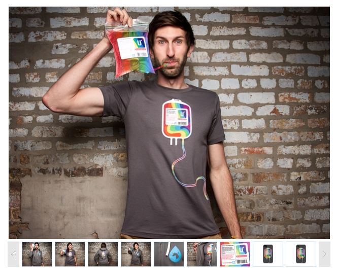
Threadless, a designer t-shirt shop, uses another interesting approach. They have multiple product photos and they also include additional products: sweaters, iPhone cases, etc., for the specific pattern. This leads to possible add-on purchases and helps visitors find the right item for their favorite design in case they change their mind or reached the product page by mistake.
The bottom line is that when you’re selling online, product photos are vital to inducing the desire or your visitors and confirming that they’ve made the right purchase decision.


