The Ultimate Guide to Ecommerce Category Pages - Chapter1
The Ultimate Guide to
Ecommerce Category Pages
1Listing products in an online store
One of the benefits of running an online store is that you can offer your customers a wide range of products. Product ranges can vary from store to store, with one site selling only a dozen products and another site selling a hundred thousand.
To be successful, your goal is to help your customers find the optimal product, the one that best solves their problem or best satisfies their needs. You also want to support different types of customers in selecting the right product, just as a salesperson in a physical store would do.
When a customer arrives at your site, they have a set of goals in mind or a problem they are looking to solve. If your marketing is correctly targeted, then you carry a product that is a match for the visitors to your site. Hopefully, you have several products that satisfy their needs or provide a solution to their problems. If you can show your customer the right product at a good price, they’re likely to make a purchase. Sounds easy, right? However, there are two challenges you must face:
- The first challenge is that you don’t know which product would be the best fit for your customer. You don’t know their exact goals and problems, and consequently you don’t know which product is best to offer them. So, the first step is giving your customers the ability to select the product that offers the best solution for them. The goal in the selection support phase is for your customer to narrow down your inventory to the product or products that best meet their needs and budget.
- The second challenge is that customers on the Internet can seem to be impatient. Most won’t review your entire product range for a possible solution. Your customers want to feel that they are progressing towards a solution with every click, and if they don’t feel that these clicks take them closer and closer to a solution, they will leave your site disappointed. Customers on the Internet also have their own logic by which they browse your products, use your menus, and the other functions of your site; and they are not happy if the system tries to force a different, foreign logic on them. They’ll simply decide that learning the system is not worth the effort and will look for the product somewhere else.
So it’s important that your online store provides the ability to select products as quickly and efficiently as possible, and for it to be easily understood by your customer.
1.1. Help your customers with product selection
When presenting a product range in an online store, your goals are to:
- Help your customers select the product from the product range that is best for them
- Provide a price that meets their budget
- Convince them that they are making the right decision
Your overall goal when listing a product range in your online store is to help and support your customers with the decision making process. Let’s see how you can achieve that goal by using best practices to list your products.
1.2. Listing products and sort order
The most basic method for displaying a product range on your website is to list the products and their features. Customers can compare the different elements of each product to find what best suits their needs.
You can improve on the most basic listing of products by focusing on two areas:
- What your customers see – displayed product information
- What your customers see first – the sort order of products
You can choose which product information is most relevant and you can control the sort order or use the system to create a sort order based on some particular product characteristic.
It’s also important to allow your customers to change the sort order as well, and sort the products according to their own wishes. For example, price: lowest to highest, or, date: newest products first. This way, your customers can quickly make their selection from several products available, because they will usually only need to look at the first few products in the list once they have adjusted the sort order to meet their needs.
1.3. Ensuring the option to narrow down
When you have a large number of products, basic product listing may not be effective. You can list 1,000’s of products, but if it’s difficult for your customers to find what they want, they won’t make a purchase.
You must provide options for your customers to narrow down your product range to a more manageable and useful number of products from which they can select directly. A thousand products are never manageable, but ten almost always are. The optimal quantity however, varies depending on the product range. This narrowing down can take place in several steps: the more products, the more steps. Later in this guide we’ll look at the primary tools for narrowing down: categorization, filtering, and searches.
1.4. Recommending a specific product
It’s good practice to increase the desire for some products in your product range by recommending products to your visitors. It’s best to recommend products that will interest the greatest percentage of visitors. You can base this on sales numbers or page views. This is not only useful and important for browsing visitors, but it’s also important for customers who are further along in the decision process and are searching for a solution.
You can also look at recommendation from the other side, products you “don’t recommend”. Of course you recommend all your products, however, If the product selection is too large and your customers cannot make a decision on their own, or they cannot narrow down the selection any further, then you can help them make their decision by removing a product from the list, by “not recommending” it. The more products there are in a specific category, the more important it is to remove one, or even more to help your buyers reach a decision and make a purchase.
1.5. The fold and “call to action”
Category pages are special pages that help your customers make a selection from a specific set of products. The goal of category pages from your perspective as a seller is to “push” your customers to one product page, meaning they should select a specific product after visiting the category page.
You can think of category pages simply as pages that list products enabling your customers to select the products they need. However, this thinking is not comprehensive enough. A listing of products is only one role of a category page.
In fact, category pages are most effective when they use all three tools of selection support: product listing, narrowing down options, and specific product recommendations. The more products there are in a specific category, the more important this is.
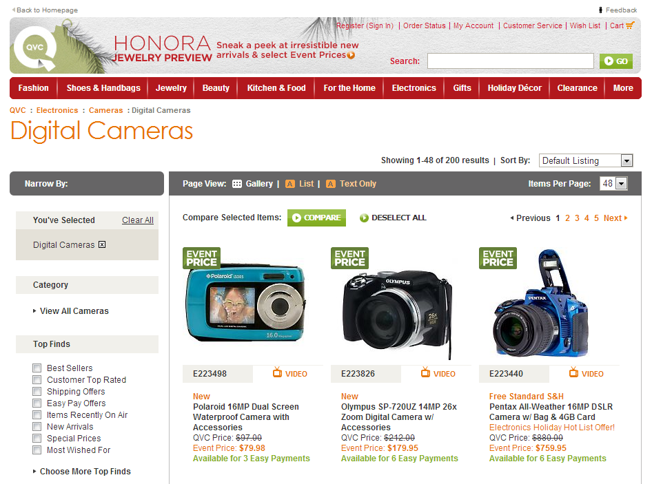
A good example of this is the QVC.com category page for cameras:

On the category page from QVC.com there are 200 products in the category. However, the visitor has the option to narrow down the list, according to product type, price category, and other specifics. Furthermore, the page recommends three specific products from the category.
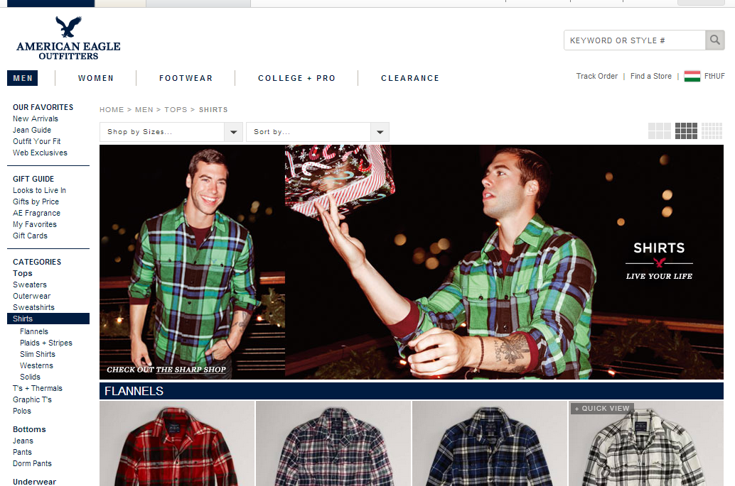
The American Eagle Outfitters AE.com category page, more than simply being usable, is another good example of a category page which uses all three types of selection support:

The specific category at American Eagle Outfitters AE.com site can be further narrowed down with sub-categories and size selectors, and there is a recommendation for a featured product in the header.
One further note to help you broaden your perspective on the role of category pages: Category pages can be imagined as home pages for your online store. Let’s say you have an online bookstore, which has the following three main categories: literature, lifestyle, and business. Each of these category pages should be designed as if they were home pages or landing pages for your store: it should be well designed to make a good impression and visitors should be able to find all necessary and important information.


