The Ultimate Guide to Ecommerce Category Pages - Chapter2
The Ultimate Guide to
Ecommerce Category Pages
2Product listing best practices
Product listing, as its name implies, is the listing of all products in a specific category, and it is the best-known part of category pages. Typically, your customers review the list of products and then decide which product best fits their perceived needs.
2.1. Information displayed about a product
Some questions which usually arise when listing products are: what information should be displayed about individual products on the category pages, and what should be displayed only on the product pages? To answer these questions, you must consider two important criteria of category pages to determine what product information would be best to display:
- The category page should have all the information needed for a customer to choose between products. This may vary by customer segment, so you’ll want to have all the necessary information for each type of customer to make a choice, whether it’s style, budget, or another feature unique to your industry.
- The amount of information you provide on the category page for products should be what’s necessary and nothing more. You want as little as possible so you can fit as many products as possible on a single page. This will help keep the list usable for your customers. It’s best to put any information that is not required to make the selection, but is instead used to persuade, on the product page.
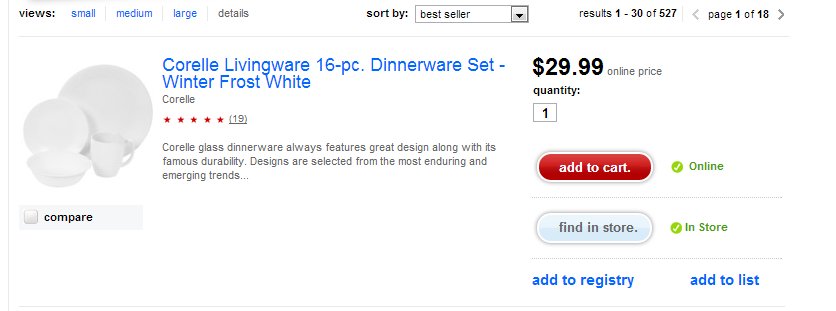
The American Eagle Outfitters AE.com site uses a quick-view function that allows a customer to view more product information without crowding the category page. Using this quick-view function enables the product to be added to the cart, so the customer does not have to navigate to a product page.
Some types of products however do need more details. The B&H Photo Video site provides more product details on the category page because it is a store where their customers need certain specifications listed in addition to a name and a price. They also use a third column to show information on stock and shipping.
2.2. Photos, graphics, and icons on category pages
Quality photos are also important to make a category page shine. As the old saying goes, a picture is worth a thousand words, and using photos can help reduce the amount of product information you need to display.
As with product information, you should not provide too much. Photos should be sized so you can display a good number of products on each page. They should also not be too flashy or make one product appear better than another, unless of course you intend it to be that way!
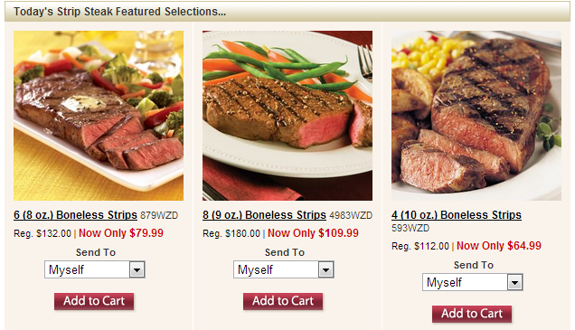
In the above example, the Omaha Steaks site shows how an appetizing image can help increase shoppers’ desire for products.
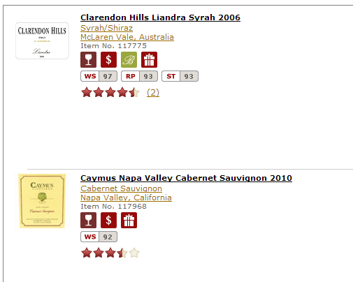
In addition to photos, other graphics can be used. Wine.com uses icons to display different features for its products. They also display scores for the products from specific wine-connoisseur sites.
The use of icons is helpful if your store is structured around one kind of product, meaning much of the product information is the same across products. In this case, a system of icons can be created, but it must be done carefully, because this solution has a disadvantage as well. It’s important to create a simple set of icons that are not complicated to learn for new customers.

BlueNile’s site uses a quick-view function for product information that displays when a customer hovers their mouse over the product on a category page.
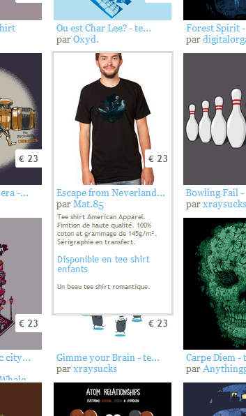
The lafraise.com website uses the same solution but from another perspective. Here, when a customer moves the mouse over a design, additional information and another photo showing the design as a t-shirt is displayed. This solution can also be used if it is helpful to display a photo of the product from a different angle.
2.3. Number of products per row
The number of products that can be listed in a row depends on the information to be displayed about the specific product. And this primarily depends on what qualities customers use to make a selection, as well as whether these qualities are enough to induce their desire.
Often, only a single product is listed in a row. In most cases this is rather wasteful, so it should only be used if the necessary information requires the space.
There are shops that list five to six products in a row, but this is the other extreme: only very small product pictures and little product information can be displayed, which may negatively affect usability. So it’s best to make a compromise.
Let’s look at some examples of product listing in row:
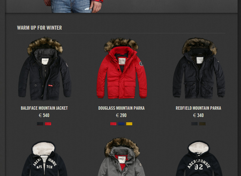
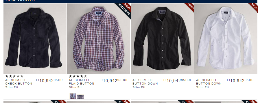
The Abercrombie and Fitch site uses a “less is more” approach displaying only the product image, price, and name on the category page. This style is characteristic of premium online boutiques. There is room for three good-quality pictures in each row.
There are four or five products per row at the ProFlowers site:
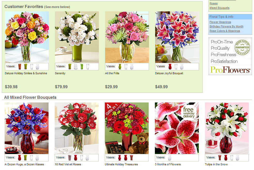
Because the site displays only a picture, name, and price for each product (and the available vase), and it uses an entire page for product display. The five products fit in a row, although it is slightly crowded. It would be more satisfying with one less product in favor of more useful product placement. Remember, customers are willing to scroll down for additional products as long as it feels like it’s worth staying on your site.
Crutchfield’s site is also easily navigated, but they use a one product per row solution because they have a lot of technical specifications for their products.
Amazon uses a feature that allows customers to change the way product lists are displayed on their category pages.
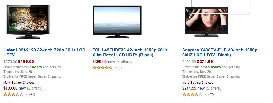
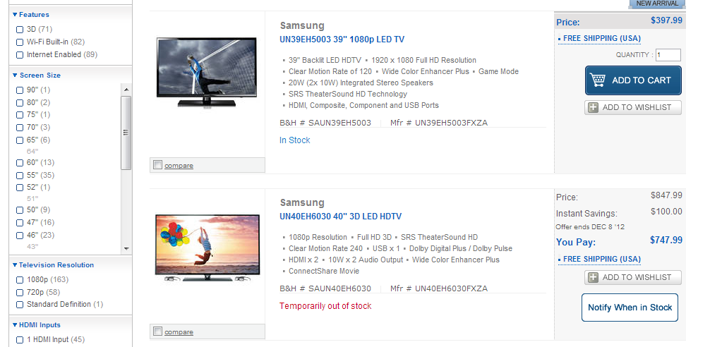
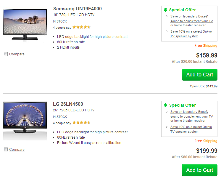
Here we see three TVs in a row despite these being products that typically require more information.
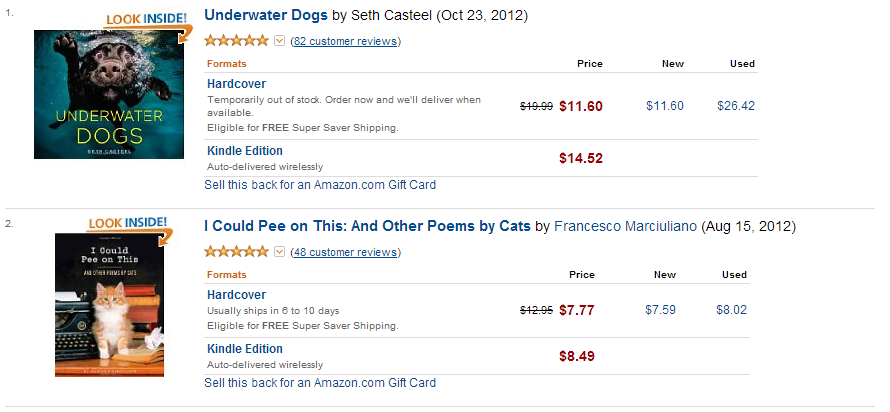
You can also choose to list only one book per row at Amazon. You would expect books to have less technical specifications than TVs. However, at Amazon, books are usually two or more products, aside from the hard copy version, they also sell digital and sometimes even used versions. This may explain why they offer the one product per row solution for viewing books.
Allowing a customer to choose the display method for product lists is especially useful if a given product range is wide-ranging and different amounts of information have to be displayed for different categories. Take care when using this solution. You should always be sure the default display setting is the most effective display method for the product range in that particular category.
Target.com offers four display methods:
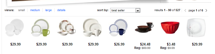
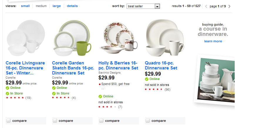
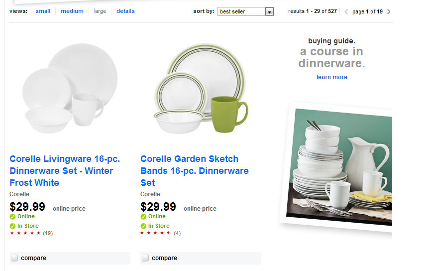
Target’s approach is understandable, because their product range is extremely wide. One drawback to their approach is that every category uses the same default view, so they display the same amount of information about e-book readers as they do about earthenware plates.
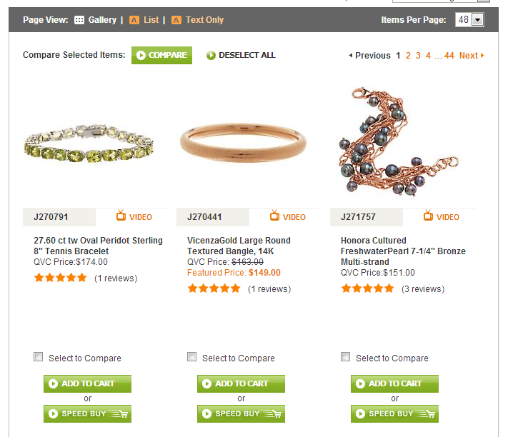
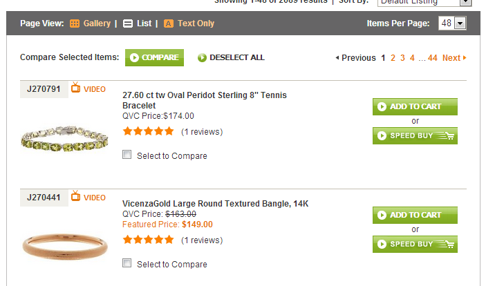
On QVC.com they offer different views, however, the same information is displayed in the table view as the list view, this seems redundant and not worthwhile for a customer browsing the site:
While different layouts may be helpful, it’s important to take advantage of the layout of each view to provide more or less information as appropriate.
2.4. Number of products per page
The number of products you list on a category page is less important than you might think. It’s fair to say that scrolling is a slightly easier operation than loading another page, so don’t be afraid of showing more products on a page. It is however worth displaying at least ten, even if only one product per row is displayed.
In the past, displaying a lot of products on a page was avoided because of long download times. With lots of products there were lots of pictures, and that meant a lot of downloading. This concern has lost its significance with today's high-speed Internet connections. However, it’s still best to display fewer than 50 products per page.
Many category pages have another important function worth mentioning, a dropdown list which allows customers to choose how many products they want to display at one time. The “Items Per Page” choices in the dropdown list should be multiples of the number of products per row. For example, if you show 6 products per row, then the “Items Per Page” numbers should be 12, 24, 36, 48, and so on.
The following screenshot from Shoes.com provides a good example of customer display options.
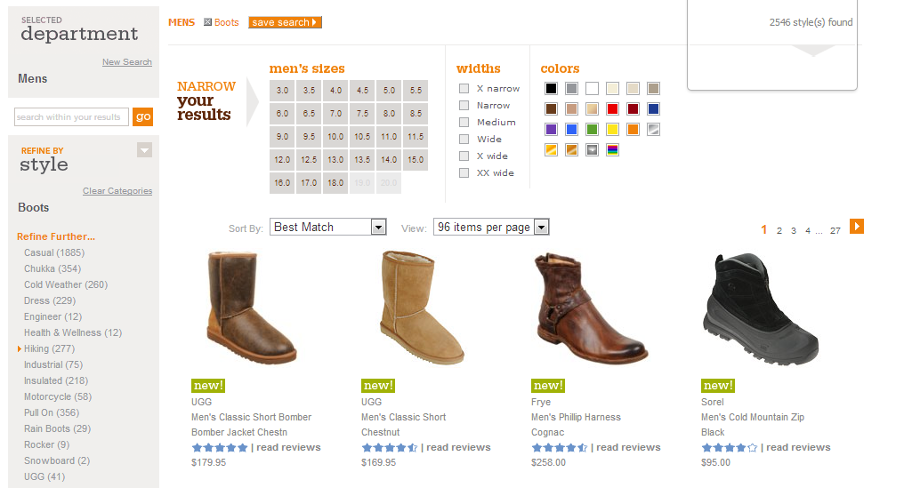
The site displays 96 products per page as a default because the products are generally easy to “scan”. If this is too much for a customer, they can set the desired number of products to be displayed, or use the column on the left or the large filter at the top to narrow the list.
2.5. Sorting products in a list
Providing your customers the option to sort products in a list is another feature of product listing that can help make your category pages more effective. It’s important that the sorting options are based on information or features that are relevant to your customers.
When your customer has the ability to determine sort order according to a quality that is important to them, the number of appropriate products can be narrowed down, and less product filtering may be needed.
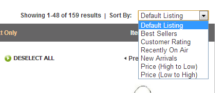
This screenshot shows the QVC.com sort list. For their audience, sorting by product name (A-Z) has no practical significance so it is omitted from the list of options.
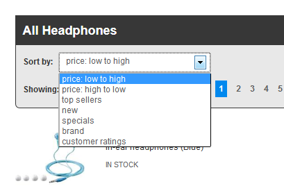
The same is true for the Crutchfield.com site. They only leave the important options for sorting. Notice the sort by brand option, which is an important factor for their buyers when making a purchase.
It is advisable to provide your customers several sorting options. You want each audience segment or customer group to be able to find the sort order that is best suited for them. However, the default sort order, the sort order the customer first sees, has great significance for two reasons:
- Even though they can change it, most customers will use the default sort order.
- You can control the default sort order as well, so you have the option to emphasize products, thus recommending them.