The Ultimate Guide to Ecommerce Website Design - Chapter1
The Ultimate Guide to
Ecommerce Website Design
1Store layout
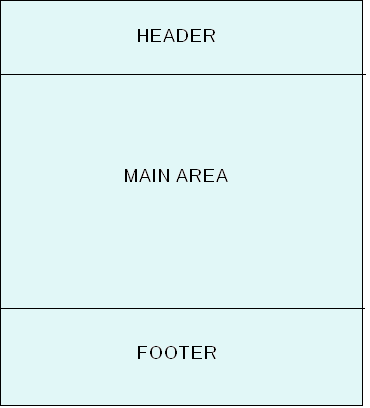
While there are many smaller elements, the layout of your ecommerce website can be divided into three big sections: the header, the main area, and the footer.
The size of the header and the footer can vary significantly from store to store. However, in general, it’s sensible to make the header as small as possible, so that the main area has as much space as possible.
1.1. Header
Almost all online stores have a header, so this is a good place to start. And, a header typically appears on the top of your ecommerce website, so let’s take it from the top!
A general rule for headers is that they should be as “thin” and as functional as possible. Headers should also draw as little attention as needed so the focus is on the main content area.

The wrangler.com header is a good example of an efficient header. As you can see, it’s thin, functional and doesn’t distract visitors. There is the main logo, the important menu items, the “mini-cart”, and the search bar. All the elements you need, and nothing to distract visitors.
One of the common mistakes made by smaller online shops is to place a large attractive image in the header. The result is a thick, purposeless, but very attractive header. Surprisingly, many stores do this when their products are attractive in themselves.
This is a mistake because thick headers like this, packed with “pretty pictures”, draw attention away from the products and offers in the main content area. In ecommerce website design, “beauty” means more than “pretty pictures”. A beautiful ecommerce website is attractive and keeps the attention on the products. It’s better to make the offers in the main content area attractive and eye-catching, let the products catch the visitor’s attention not the navigation!
There is only one situation when images in the header are useful: when you want to clarify the nature of your website. However, even in this case try to avoid this as a solution and use the first large image on the home page in the main content area to clarify the nature of your website.
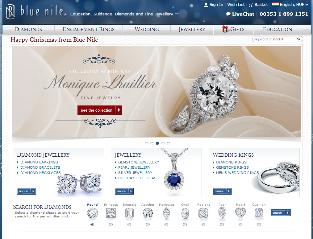
Although BlueNile clarifies what they are selling in their header with additional text, there is no need to read it. The first large image on their home page in the main area always includes a fine piece of jewelry, which epitomizes the essence of their product range and immediately clarifies what they are offering.
To sum up, the most effective headers provide a clean and functional element at the top of your ecommerce website that doesn’t distract your visitors. Let your products shine in the spotlight in the main content area and you’ll be a step ahead of the game.
1.2. Footer
Now, let’s learn about the footer. The footer is at the bottom and is typically only visible after a visitor scrolls all the way down. Because it’s at the bottom and a less significant part of your ecommerce website design, the design of the footer doesn’t have the same constraints as the header. For this reason, there are many different layouts used in the footers of ecommerce websites.
On some ecommerce websites, the important menu items or categories are displayed in the footer. On other sites, contact information is displayed. And, in some cases, a large body of text relating to the store is placed in the footer because it improves search engine optimization.
If a webpage extends too far down and requires a lot of scrolling to return to the top, it’s worth placing a “back to top” link in the footer. This allows the user to quickly return to the top of the page with one click.
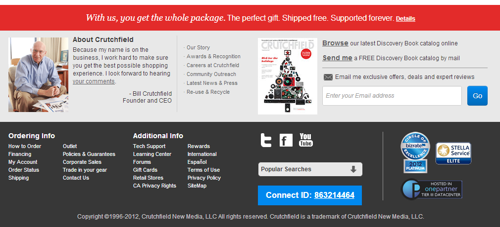
At crutchfield.com, links to purchase information, important content, popular searches, and company information are all placed in the footer. The footer also includes an option to subscribe to community and direct marketing channels, and significantly strengthens customer trust with a short introduction and different certificates certifying the site. Indicating free holiday shipping is just the icing on the cake.
1.3. Main area
Let’s turn our attention to the main area of your ecommerce website where most of the action happens. Often the main area is further divided into a column layout with side columns and main content. You can see one-, two-, and sometimes even three-column designs on ecommerce websites, depending on the number of columns the main area is divided into.
Often, the column layout of the home page and sub-pages will vary depending on the design. For example, the home page might be two-column and the sub-pages will be three-column. Category pages, which list all the products in a specific category, often include an extra column compared to the product pages. This extra column might be a list of the products in the category, or a list of features you can use to filter the products in the category.
The column layout you use in the main area of your ecommerce website depends on the type of information you’d like to communicate on specific pages. The general conventions for column layout in the main area are: a one-column layout on the home page, a two-column layout on the category pages, and one- or two-column layout on the product pages.
Let’s take a look at a few examples:
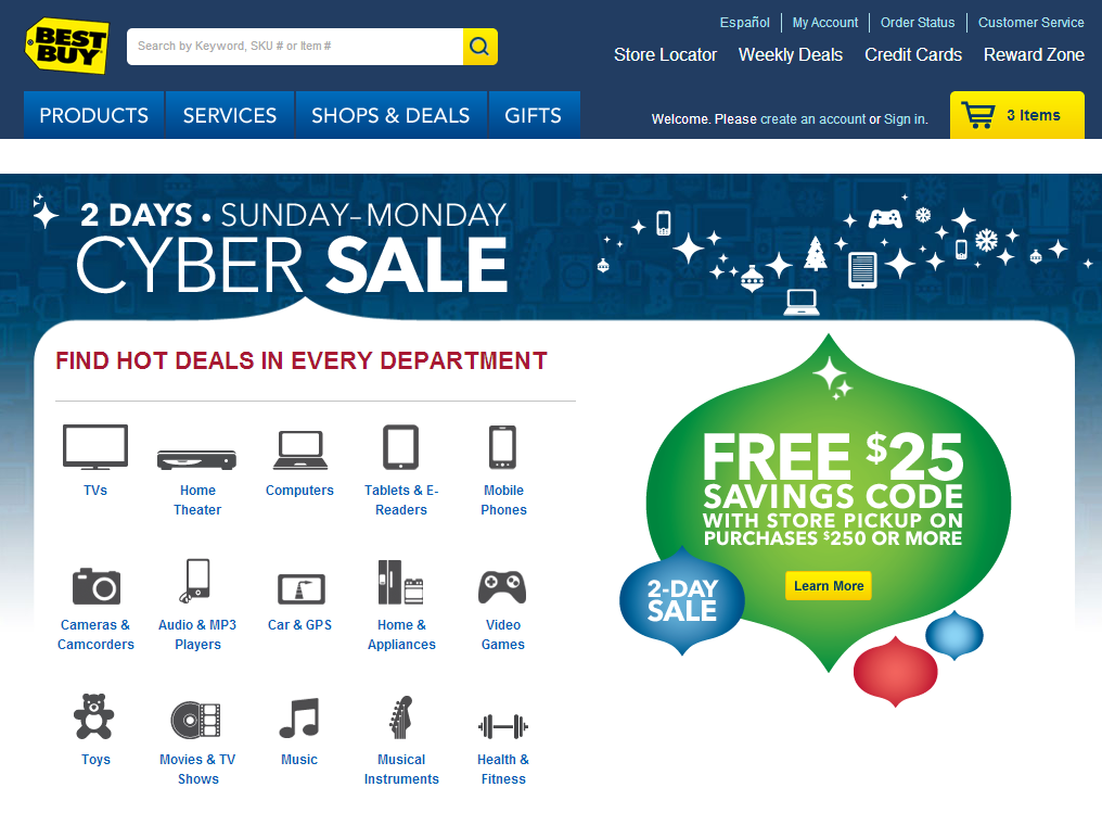
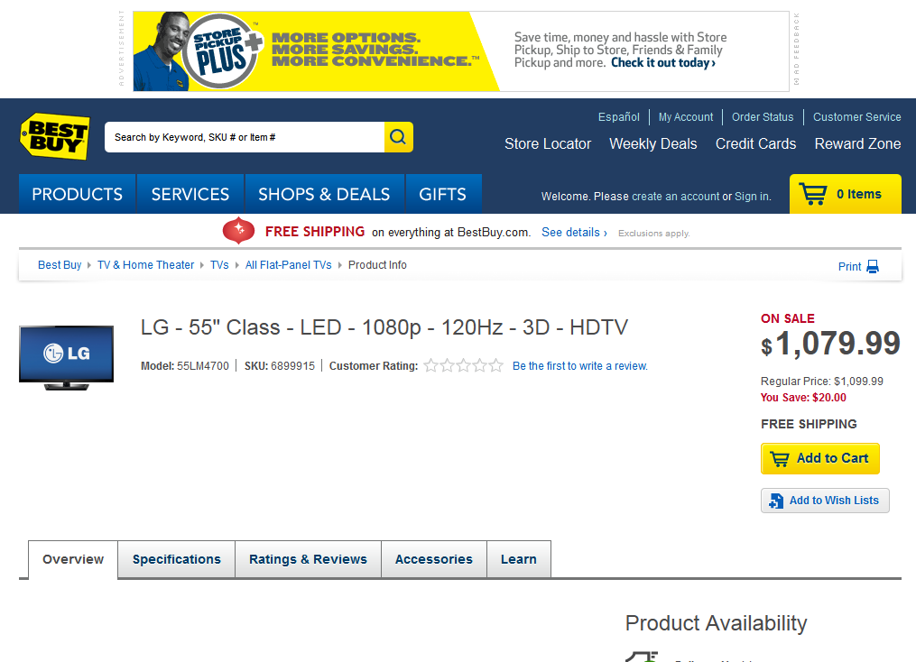
As you can see from the above screenshot, BestBuy.com uses a one-column layout on their home page. They also use a one-column layout on product pages, and for their category pages, they use a two-column layout. This is the convention nowadays, but to their credit they were the one of the first sites to do so.
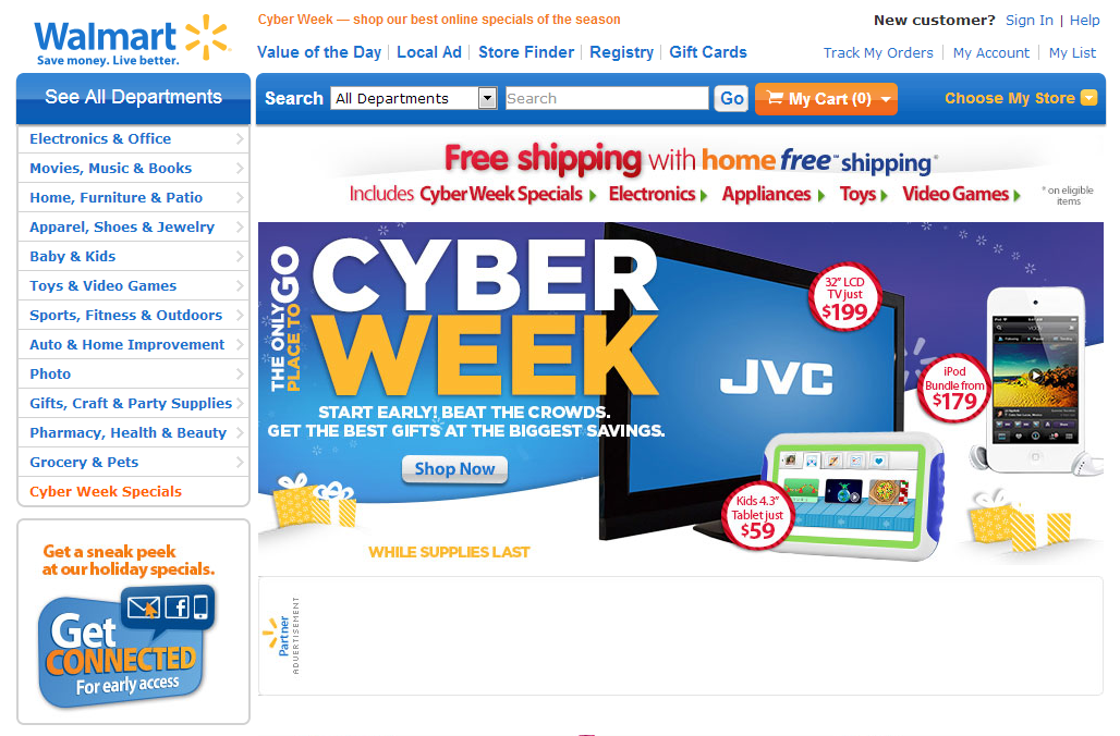
Walmart uses a two-column layout on their home page because it is the only efficient way to display their main product categories. Trying to stuff all this information into the header would result in a thick header, and using drop down menus could “hide” the categories people need to see. By using a two-column layout, Walmart makes all their main categories clear when you arrive at their site and they can promote their special offers with a large image in the main content area.
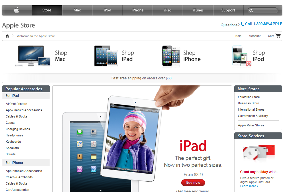
Apple uses a three-column design on the home page of their store, so they can communicate a lot in a relatively small space to visitors and customers. Their “More Stores” category adds information aimed at specific audiences, and their “Popular Accessories” lists additional products that will appeal to all buyers. In the main content area in the middle, the products get the spotlight with a large image. Well done.
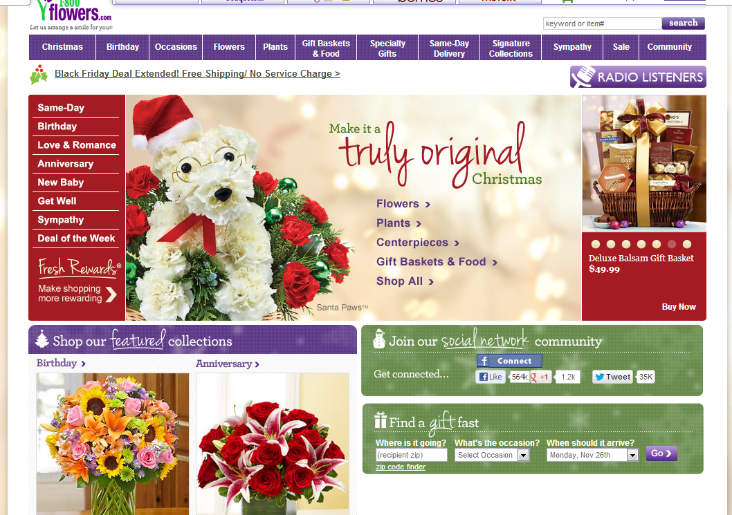
The 1800FLOWERS site is an interesting hybrid. They start with a three-column layout and then transition to a two-column layout. This is not a conventional layout, and it makes it hard to guide a visitor’s attention. Looking at the page, it’s difficult to get a clear idea of what each column or area is intended to do. Sure, the categories column seems obvious, however they list another set of “categories” in the main image. The site has a pleasant appearance, you might say it’s “beautiful”, however it lacks the functional beauty and simplicity needed to be an effective ecommerce website. Perhaps a user test would reveal that this layout is effective. From our eyes, it seems to be a little too much for a visitor arriving at the site for the first time.
One final note about column layout in the main area of your ecommerce website: The more columns there are, the greater the possibility that something on your page will distract your visitors. For this reason, never use more than three columns.
1.4. The fold
Before we look at different layouts, it’s important to learn about the fold. The fold is the line that marks how much of a website is visible without scrolling down. The area “above the fold” is what a visitor can see when they arrive at your site without having to scroll down. Everything “below the fold” requires scrolling to see.
The fold changes depending on screen resolution. Typically, a visitor to your site will see different elements above the fold at 1024x768 (tablet) resolution, than they do at 1920x1080 (full HD monitor) resolution. Understanding the fold is the first step in preparing your ecommerce site for visitors with different screen sizes. Check your ecommerce website at different resolutions to see what is above and below the fold.
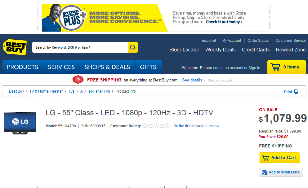
Here you can see the BestBuy.com product page at 1600x900 and 1024x768 resolutions. Note that the detailed product specifications are not visible above the fold at 1024x768 resolution. The 1600x900 resolution has more information above the fold.
1.5. The fold and “call to action”
The “call to action” is the link or button that you want visitors to click on. This is typically “Add to Cart” for an ecommerce website and “Sign Up” for a landing page that collects subscribers.
It’s worth noting that the fold is not as important as many people think it is with regards to call to action placement. A product page can be just as effective even if the call to action is placed below the fold.
Typically, page elements should be placed on the page according to their importance. However, in certain situations, such as the introduction of a new product or the announcement of new, lower prices, this information should take precedence over the call to action.
The reason this information should take precedence is that a customer will only add a product to their cart if they perceive the value to be greater than the price. This is especially important in the case of products they are not familiar with, so you have to emphasize every element and benefit to your customers. Emphasizing these important elements before the call to action may be necessary to convince your customers to make a purchase.
The second reason the placement of the call to action is not so critical is that visitors to your website scroll. Scrolling is a natural interaction when navigating websites and most visitors will naturally see your call to action when they navigate your site. You can encourage scrolling by using visual elements to indicate that there is content below the fold.
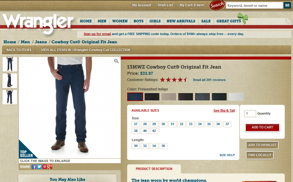
Viewing the wrangler.com site at 1024x768 resolution, you can see the top of some of the elements below the fold, “Product Description” and “You May Also Like”. Showing a small part of these elements above the fold indicates that there is additional content to scroll down and see below the fold.
Whenever possible, you should still place your call to action or “Add to Cart” button on product pages above the fold! When a visitor arrives at your ecommerce site and they like what they see and buy immediately, this is a big win for you. Keeping a call to action above the fold makes impulse buying like this possible for people who are eager to buy or may simply be too busy to scroll.