The Ultimate Guide to Ecommerce Website Design - Chapter2
The Ultimate Guide to
Ecommerce Website Design
2Devices and different layouts
We’ve learned about the fold, and the three big sections of a website: the header, the main area and the footer. Now we’re going to take a look at different layouts. Wait a sec! Didn’t we already talk about different layouts when we learned about the header, main area, and footer?
Yes! We touched on different layouts as we explored the main sections of an ecommerce website. However, there is more to layout than meets the eye. Designing the layout of your ecommerce website is one part, displaying your ecommerce website across a range of devices is another, and sometimes more challenging part of ecommerce design.
Why is it more challenging? For one, screen sizes vary. If we lived in a world where there was only one computer sold with one screen resolution, say 1024x768, life would be a lot easier for ecommerce website design! We’d follow the conventions for the layout of the three big sections and we’d be all set.
The early days of ecommerce website design were a lot like this ideal scenario, most monitors where either 800x600 resolution or 1024x768 resolution. However, anyone who has visited a café lately will tell you, there are a lot of devices with different screen sizes and resolutions. What’s more, people use different operating systems – such as Windows or Mac OS on their PC, or Android or iOS on their smartphone or tablet.
In addition to the operating system, people also use different web browsers on their PCs, smartphones, and tablets – Safari, Internet Explorer, Firefox, Chrome, and Opera, to name a few. But wait, there’s one more layer to this cake! The technologies for accessing web pages can be different too. Mobile browsers and devices might not have all the technologies available on your PC. For instance, Firefox on mobile behaves differently than Firefox on desktop.
Holy kaww! You can see how displaying your ecommerce website on different devices is a challenge. You want to provide a uniform experience to your customers when they visit your ecommerce website, however, your customers are visiting your website using different devices, with different screen sizes, at different resolutions, running different browsers that feature different technologies…phew! But don’t fear, with a clear understanding of ecommerce website design for devices and different layouts, you can find the right balance between a uniform design and catering to the specific devices and technologies people are using when they visit your site.
2.1. Challenges for different devices
Let’s explore the challenges you face when designing your ecommerce website for a range of devices. The main challenge is displaying your ecommerce website the way you designed it. Typically, design starts on a PC, you build the website layout, and you put certain elements in the header, main area, and footer.
Now, let’s suppose you put in a calendar as one of the elements on your site. Although the calendar might display on your desktop or laptop well, think about someone accessing it from his or her smartphone on a smaller screen size. Will the calendar resize to fit the screen, or will it stay the same size?
When you keep the calendar the same size, it might take up a lot of the screen on a smartphone and the other elements of your ecommerce website won’t display prominently. Let’s say you resize the calendar, but if it becomes too small on a smartphone, there will be difficulty viewing it.
Let’s look at it another way. You have an iPad and a 5-inch smartphone. Your ecommerce website is made to fit a fixed resolution and a fixed screen size. How will it display on both of these devices?
When we look at other elements, such as the header, category pages, and menu structure, we can begin to see there are more challenges than simply resizing the content to fit different screens. How will you make the site easy to navigate on a smaller screen size, while keeping a simple and clear presentation of your products and marketing messages?
Ever since Apple introduced the iPhone and the world of mobile browsing, web developers have been working on the answers to these questions and creating solutions for making websites work across different devices.
2.2. Solutions for different devices
Let’s learn about these solutions and how you can make your ecommerce website design “mobile friendly”, in other words, how you can make it beautiful and simple for different devices and screen sizes. Web developers have developed four main solutions to the challenges of different devices: fixed design, fluid design, adaptive design, and responsive design.
Remember the calendar challenge we talked about? Well, if the calendar size doesn’t change, no matter what the screen size is, this is considered a fixed design. However, if the calendar size changes according to the screen size, then this would be a responsive or fluid design.
Now, let’s consider the iPad and 5-inch smartphone challenge. If your ecommerce website knew how to resize itself according to every device and screen size, it would display optimally for any visitor with any device. That would be awesome!
However, it’s quite difficult to design your ecommerce website to fit every device and every screen size. Without getting too deep into the technology, this would require some coding on your website server and in your website design. Typically this is only possible for larger ecommerce websites who have a huge budget to dedicate to the task. This is what’s known as adaptive design.
That’s all well and good for the big sites, but what’s the solution for most ecommerce websites? Well, why not have a website design that resizes automatically to the best view regardless of the device or screen size? This is known as responsive design, and you can see why it is in vogue today. It’s the best solution to the challenge of different devices when you don’t have a full-time web development team in-house!
In addition to fixed designs, responsive designs, and adaptive designs, we also have fluid or liquid website designs. For example, let’s say you are resizing the size of a web page by making your web browser window smaller and larger. While you are doing this, you see the web page will adjust and display differently as you make the window larger or smaller. This is an example of a fluid design. The website will be viewed differently in different browsers and devices based on the size of the window.
Some times a responsive design and a fluid design appear to behave the same. Let’s take an in-depth look at each of these solutions and how they address the challenges of ecommerce website design for different devices.
2.3. Fixed designs
Websites with fixed designs have a set width and no matter which browser or device you use to visit the website, the layout and look of the website will be the same. As the width and height of fixed design websites doesn’t change, you may need to scroll left and right in your browser to see all the elements depending on the device you are using.
Before smartphones and tablets became the dominant way of accessing the Internet, fixed designs were in more common use. In fact, Apple maintained a fixed design on their website for a long time. That’s right, the company that introduced mobile web browsing had a website that wasn’t “mobile friendly” for some time after the release of the iPhone.
Why would Apple use a fixed design for so long, even when they were producing the iPhone? Fixed design gives ultimate control over the experience. When it comes to creating magazine-type layouts and inserting typography, as well as other graphic elements, with absolute precision, fixed design ensures everything stays put, because, well it’s “fixed” in place!


Here’s an example of what a fixed size website design looks like – you can see ProFlowers.com in 3 different screen sizes, desktop, tablet, and smartphone. You’ll see that the site doesn’t change for each screen size. On the desktop you can see all the elements, including all the functional elements of the header. On the tablet, you see fewer elements, and on the smartphone, fewer still.
As we mentioned, when you view a fixed design on a tablet or smartphone, you’ll typically need to scroll to see all the elements. There is another approach though; you can zoom out to view the entire page. However, when you do so, the text doesn’t change, so it will become very small. On most smartphones zooming out on a fixed design, it becomes difficult and sometimes impossible to view menus, click on buttons, or simply read a product description.
This was the case for a lot of early iPhone users as they encountered many fixed design websites at the time. Pinch-to-zoom got a lot of use in Safari on the iPhone in those days! People would need to zoom out, find the link they wanted, zoom in again, then click on the link, zoom out, and on and on. It’s amazing to think that simply being able to view a website at a café on your phone was exciting enough, that people didn’t mind all the pinching and zooming.
However, these days, with many more smartphones and tablets, in fact, with more Internet traffic occurring on mobile than on desktop or laptop platforms, fixed designs are frowned upon. Apple has taken notice, and it seems, just when the shift to mobile was more than 50% of Internet traffic, they switched to a responsive design. People would willingly zoom in and out before. Nowadays, they’ll simply leave your ecommerce website and find one that is mobile friendly offering the same product or service.
A fixed design is only a solution when you have a limited number of products or a very simple message to display. Let’s say you are the exclusive retailer of one product. You may be able to use a fixed design. Simply feature that product; put in the call to action, an email and support link and you’re all set! However, even for single product retailers, your ecommerce website continues to provide additional functions, such as product support, and navigation can be tough if your header takes up half the space on a small screen.
Perhaps the only appropriate use for a fixed design now is when you want to distribute a virtual post card to thousands of people and the width doesn’t matter. You can have an image that fits on smartphones with large text and it will serve the same purpose on tablet and desktop platforms. For simple marketing messages with only one call to action, this might work.
Another place we see fixed designs today is in “theatrical” website design. No, this isn’t the design for a theater company. Theatrical websites are like a stage show where the website introduces a new product or service with a complex set of active graphics and elements that simply can’t be supported by the technology on mobile platforms, so there is no reason to be concerned with the design for those platforms.
This is rarely the case for ecommerce websites. More often this sort of theatrical design is used for portfolio sites of artists and designers who want to have tight control and make a big impression that really draws people in. These days, it’s very rare that you’ll see this used to introduce a new product. Lots of active elements and graphics to introduce products have gone out of style as websites are more geared towards the simple and clean presentation that looks beautiful and works well across all devices with minimum technology requirements.
2.4. Fluid or Liquid design
Fluid or liquid designs are the first type of designs that we’ll look at which change based on screen size. Rather than changing based on the number of pixels, fluid designs change based on a percentage of the screen size. For instance, elements will scale to 50% of their typical size when you reduce the size of your browser window by 50%. In the same way, when ecommerce websites using fluid designs are displayed on smaller screens like smartphones or tablets, the elements will also scale to that smaller size based on percentage.
Fluid designs make use of a fluid grid system, which can also change the location of elements to accommodate all elements on a page. The elements in a fluid design are relative to each other, so when they scale to a certain percentage, let’s say at 50%, one element may drop below the other to keep the elements from getting too small to interact with. In other words, as you are resizing your browser window, you’ll see one element “flow” below the other, and this is why it’s called fluid design, it smoothly scales and rearranges based on percentage. Otherwise, everything would be reduced in size too small and we would be back to the challenge of zooming with fixed designs.
Because they change based on the size of the screen, fluid designs are one solution that give your visitors an optimal viewing experience, no matter which operating system, web browser, or device they are using. No wonder fluid web designs are known to be “accommodating”.
However, using a fluid design as a solution for your ecommerce website presents an additional challenge. Because it scales based on percentage and not exact screen measurements, you lose some control over the layout and design of your site – something fixed design websites are really good at. Fluid designs were the first solution to the challenges presented by fixed designs and there are many websites that still use fluid designs.
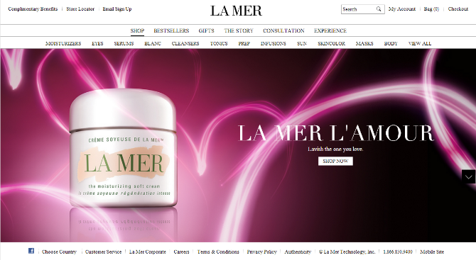


Looking at www.cremedelamer.com, you’ll notice that the elements in the header and footer “flow” relative to each other, in order to be displayed on the smaller screen sizes. However, in this example, you’ll note that the top bar of the header does not scale based on percentage and the image also does not scale well. These are examples of how fluid design can sometimes fall short of an optimal experience on smaller screen sizes.
2.5. Adaptive design
Another solution to the challenge of different devices is known as adaptive design. Adaptive design is a solution that “adapts” to different screen sizes, but maintains more control over the elements of a page than a fluid design.
Unlike fluid designs, adaptive designs use a fixed grid system that doesn’t change based on percentage. Instead, the fixed grid moves or “adapts” based on the screen size measurements. For most adaptive designs, this is in terms of pixels.
An adaptive website detects the screen size of the browser, and thereby the device, and can then change the arrangement of elements to fit the screen. We’ve seen that elements can “flow” to different locations in a fluid design, the difference is, in adaptive design there is more precise arrangement based on screen size instead of scaling or adjusting by percentage.
For example, let’s say you start with the adaptive design of your ecommerce website at a certain resolution, 1024x768. You put all your elements in place, sized and arranged the way you want.
Then, you would look at how the site looks at say, 800x600, or perhaps for a smartphone, 320x480. You would then rearrange the elements to your liking and put in code that tells your ecommerce website to display in that exact arrangement for that exact screen size.
By enabling designers to rearrange elements specifically based on screen size, adaptive designs give greater control compared to fluid designs, while still allowing them to work well across a range of devices and screen sizes.
2.6. Responsive design
Now, let’s turn our attention to the favorite solution among web developers to the challenge of displaying websites on different devices, responsive design. Ecommerce websites that have a responsive design change in “response” to the device or screen size.
Responsive designs automatically change according to screen size like adaptive designs. However, they are built on a fluid grid instead of a fixed grid. In other words, responsive designs take elements of fluid design and adaptive design to create a new solution that works well across a wide range of devices and screen sizes.
Given the increasing number of devices, it’s often difficult to create a precise layout for every possible screen size. This is where adaptive designs fall short. Responsive designs allow you to set precise arrangement of elements according to screen size, and can also fluidly rearrange to meet different sizes. It’s the best of both worlds!
When you build your ecommerce website using one of the latest responsive designs, you can be sure your website is displaying the way you want whether it’s being viewed on a PC, laptop, tablet or smartphone.
2.7. Adaptive vs. Responsive design
Adaptive and responsive designs both offer a solution to the challenge of displaying your ecommerce website on a range of devices. Where the two methods differ is in their delivery of the layout: responsive designs are implemented mostly in CSS with fluid grids and flexible frameworks, while adaptive design has a layered approach which uses scripting to assist with detecting and adapting to various devices and screen sizes.
One of the reasons that responsive design has become the preferred solution is that the scripting needed for an adaptive design often needs to be run on the web server itself to be able to detect all of the possible screen sizes. Responsive design takes more code to execute, however, many ecommerce website frameworks and themes now use responsive design so the initial development and maintenance costs may not be as much as following an adaptive design approach.
A few examples:
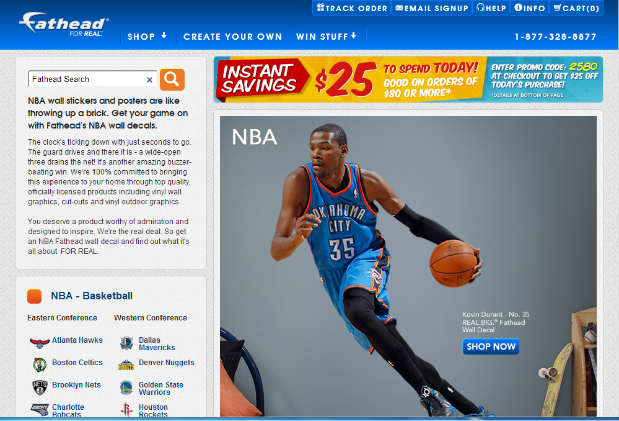


The website www.fathead.com does a fine job of using a simple adaptive design – you can see it in 3 different resolutions.
Now let’s see a sample responsive site:
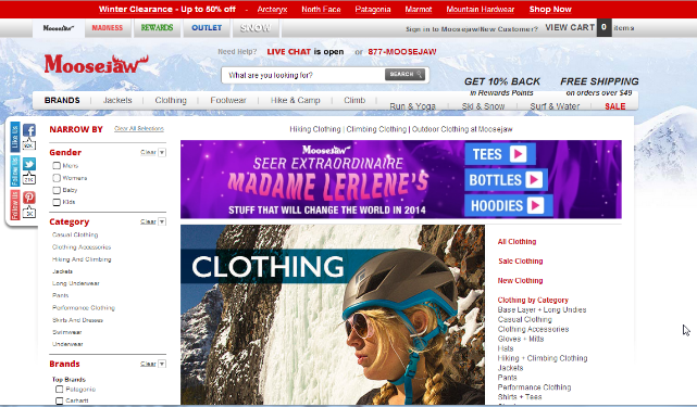


www.moosejaw.com is a great example. Try accessing the site from your PC and you will see that the view is always optimized, no matter how much you zoom the screen in and out.
When you consider how many different devices are on the Internet these days, it’s vital that your ecommerce website looks beautiful, and is clean and functional on as many devices as possible.
Fluid design, adaptive design, and responsive design all offer a solution to meet the challenge of designing for different devices and screen sizes. Most recently, responsive designs have become the preferred solution, with their flexible grid structure and the ability to precisely specify layout and design at different screen sizes. With responsive design, you can be sure your ecommerce website will look good on nearly any device under the sun…or under the umbrella at the café!