The Ultimate Guide to Ecommerce Category Pages - Chapter5
The Ultimate Guide to
Ecommerce Category Pages
5The Homepage
We left one very important part of your site for the end, because its structure is similar in many ways to the category pages, as you have to use the same selection methods.
Your homepage is the page a customer lands on when they enter your online store’s URL into their browser — for example, www.nameofstore.com. It’s the main page of your site. The structure of the homepage is usually the most complex and the hardest to optimize. However, it’s extremely important to optimize your homepage, as this is the page seen by most customers and typically the most viewed page on your site.
The challenge with designing a home page comes from the fact that people are arriving at your site from a number of different sources. Some visitors may have arrived here by search, an advertisement, or from a link on another site. There is limited space to communicate your message to all of your customer groups that arrive from different sources.
5.1. Roles of a Homepage
While the goal of category pages is selection support, and product pages to persuade, your homepage must fulfill numerous roles.
Selection support
The most important task of your homepage is to start visitors in the purchase process while appealing to buyers from different sources. Your goal is to “push” them to a deeper page, and to collect information about them for further, more purposeful communication. This may vary by customer type. On one hand, the homepage is meant to provide both determined and solution-seeking visitors a way to start shopping and find what they need. On the other hand, your homepage should also welcome browsing visitors, help build their desire for your products and keep them on the page longer.
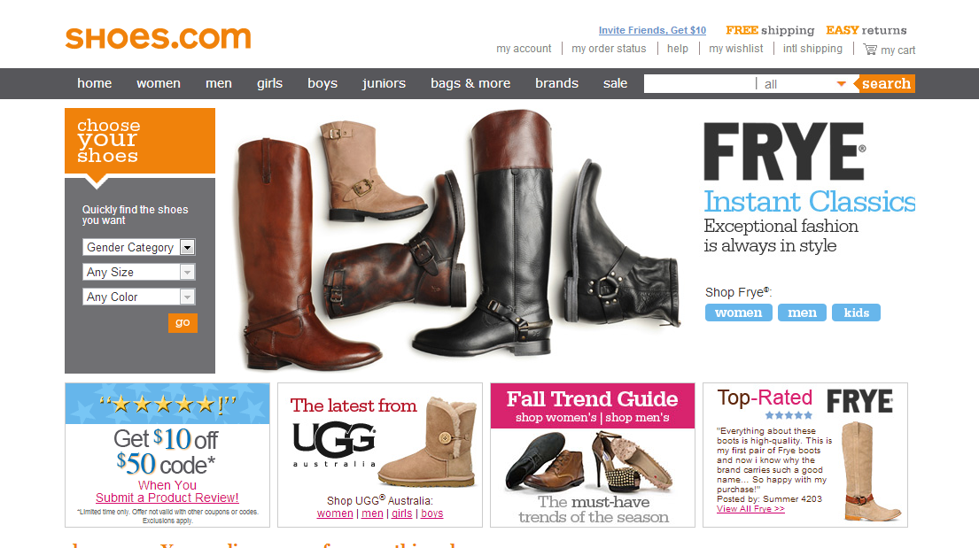
Shoes.com does an amazing job in this regard. It has a clearly visible product range, so with the category system and good searching functions, every customer will be able to find the solution they are searching for and start their shopping. There’s also a nice large graphical image to appeal to browsing visitors and invite them to stay on the site, and browse further.
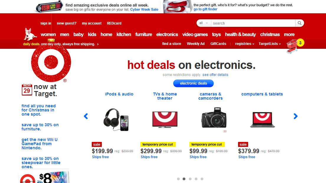
Target.com has a much harder job because they carry such a wide range of products. The homepage doesn’t have a lot of features, because there is not enough space to do more than display a properly usable category list, featured offers, and featured categories.
Page identification
Another goal of the homepage is assuring visitors that they are on the right site and making absolutely clear what the site is about. Visitors must know at first glance what the page is selling or what problem its products can solve. A good test for this is to show your page to a stranger and see if they can tell what you are selling at first glance.
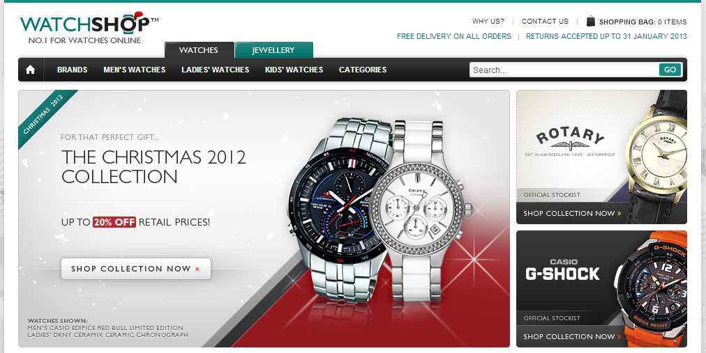
WatchShop.com: This is a perfect example of clarity in relation to what exactly is being sold. There’s no mistaking their product offering here.
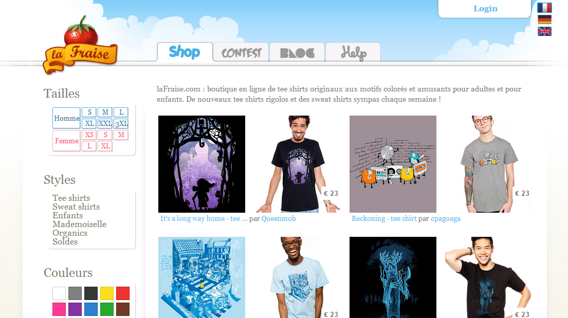
Looking at the lafraise.com site, it is not evident at first glance we have arrived at a site selling funny and unique t-shirts. The size and color selector on the homepage and the product images indicating both pattern and t-shirt style could be unclear for some customers though. Looking at this homepage, it feels more like a category page. For a homepage to succeed is has to offer a clear direction for visitors who are browsing the site for the first time.
Navigation center
Your homepage also acts as a navigation center. In other words, if a visitor gets “lost” anywhere on the site, the homepage can act as a secure place they can return to at any time and restart browsing.
Because of this central function of being a “safe zone”, all the functions such as support, tracking, login and account management should be accessible from the homepage.
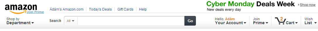
The header at Amazon on the homepage acts as a perfect navigation center. They have successfully positioned the main categories — for browsing and solution-seeking visitor; the search function — for solution-seeking and determined visitors, featured offers — for browsing visitors, account and wish list — for returning customers, a premium program link — for returning customer incentives, as well as the cart.
Communication
Your homepage can be one of the most effective places for presenting your major competitive advantages and communicating your most important messages. Do you have a particular competitive advantage or a reason why buyers should choose your products? If you have a good answer to this question, it’s definitely worth communicating it emphatically on the home page.
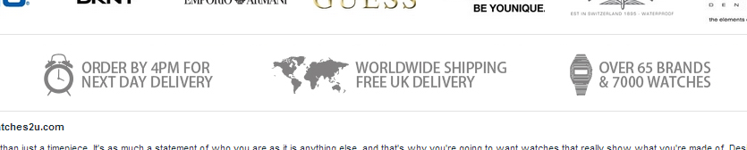
Watches2u.com shows their competitive advantages in a top priority position on their site, right under their list of manufacturers.
Other goals
Your may have other goals with your site other than making an immediate sale, such as: persuading visitors to subscribe to your newsletter and building your email list, increasing brand name recognition, increasing traffic for your offline or brick and mortar shops, content delivery, and more.
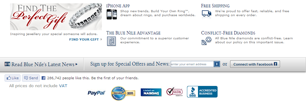
BlueNile.com places a number of options not directly related to purchases right above the footer. They use this area for news, connecting to Facebook, and downloading an iPhone app, and more.
There are competing interests when building a home page. It’s important that while you provide other functions, you are sure to include the basic features that allow customers to start their shopping experience by selecting a product or category.
5.2. Homepage layout
Trying to fit all the functions into a homepage and still make it useful for browsing and buying is challenging. Because of this, the layout of your homepage is crucial. This is the page most visitors see first and this is where they form their first impression about your site. Visitors decide in an instant whether it’s worth staying on your site. This is especially true of the homepage, so you’ve got to have a beautiful and functional layout.
Although the homepage is one of the most important pages, it is challenging because it must be directed towards all of your customers. The wider your product range, the wider your target market, and the more you could communicate, but your available space is limited.
As a result, some compromises have to be made. As you do your best to keep the homepage simple and clear, you may need to leave such items as the cart, registration, and filters for later pages. Keeping it simple at first will hold their interest and let your customers start their “journey” through your store.
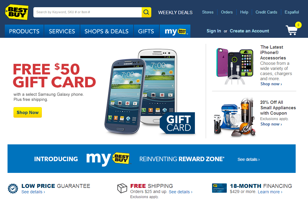
The BestBuy.com homepage is a nice example of a clean and simple presentation. You get some basic selection support to help customers find products, there’s a nice bold image with plenty of space to draw new visitors in, and the header retains many of the important functions, such as Search, sign-in, and even the cart.
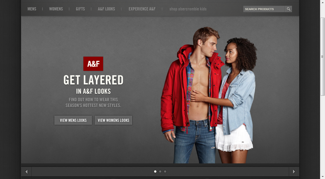
The Abercrombie and Fitch site uses a more minimalistic homepage style. The number of elements on the page is limited. There are some efforts towards selection support with categories and search, however the main goal is to draw new visitors in with a compelling image.
The balance you place between allowing determined visitors to easily find what they need from the home page and drawing new visitors in with an appealing home page is often based on the type of products you sell. A more technical site may even show categories in the left column on the home page as many more visitors are determined customers, or at least solution-seeking visitors who have some sense of what they want. Knowing your audience will help you know how to balance the functionality and appearance of your homepage.
Overall, the best practice is “less is more”. You have to structure your homepage so someone who has never seen will able to quickly determine how to navigate the page. This has to occur in a matter of seconds, so overly complex or crowded home pages are never a solution. Even if you have a wide product range or complex products, your goal is to make the home page simple and easy to understand.
Summary
When a customer arrives at your online store, your goal is to make the process of finding the right product as easy as possible. Starting with a clear home page that is appealing and functional, and continuing through your category pages to the product pages themselves.
Category pages play an important role in an online store because this is where much of the product selection occurs. Your customers use category pages as an important part in their decision-making process. By sorting lists, using filters, or drilling down into sub-categories, your customers find the product that best fits their needs.
Making sure that you use best practices for building your category pages will ensure that your customers can easily find what they need. Most importantly, the goal is to present the right set of relevant products to your customers, in a list that is not overwhelming.
You can facilitate new customers by offering recommended products, and by adding educational support to your site. Search is a great way for buyers to find what they need. However, search pages should be treated just like category pages. They are a primary point in the decision making process and many of the same principles can be applied here also.
Following all of these best practices will result in a shopping experience that is pleasant and straightforward for your buyers, which means more sales and repeat customers for you.