The Ultimate Guide to Ecommerce Category Pages - Chapter4
The Ultimate Guide to
Ecommerce Category Pages
4Advanced Ways To Help Customers Choose
In the two previous chapters we talked about helping your customers select a product from your product range. We looked at ways to build effective product lists and how to sort them, and also how to narrow down choices using categories, filters, and search. In this chapter we’ll look at more advanced ways you can help your customers make their purchase decision.
Recommended products can save time for your buyers in the decision-making process and make large product lists less overwhelming. Comparison allows your buyers to find the best product when they are having trouble choosing between different products with similar features. Educating your customers is another great way to help them select the product that best fits their needs, the more they know about the product, the better suited they are to make a purchase decision.
4.1. Provide recommended products
While it may seem a little “pushy” or strictly a sales tactic, providing recommended products actually makes the shopping experience more pleasant for some customers and makes your site more usable. There are two important reasons why you should recommend one or more products by featuring them on a category page or putting them at the top of a default list:
- Solution-seeking visitors, and especially browsing visitors, cannot or do not want to filter your entire product range. Providing a recommended product offers a quick solution they can act on immediately. From there, it’s the product page itself that will encourage the customer to make a purchase, either through a compelling description, price, or cross-sale of a related item.
- Marketing specialists have known about the problem of “too many choices” for decades. Beyond a certain level, the size of the selection will have a negative effect on purchases, as the customer “freezes” because of an overwhelming number of choices and ends up not purchasing anything. This is the basic reason for helping customers to narrow down their choices and make a selection. When there is a large product list that may overwhelm some customers, it’s best to provide one or two featured solutions to their problem, and then you can help them to make their decision by taking on part of the decision-making responsibility for them.
You can recommend specific products on the home page also.
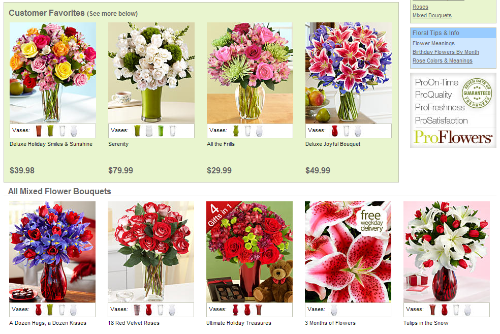
Looking again at the ProFlowers.com site, it lists the top four products in the specific categories, featured above the actual product list as “Customer Favorites”.
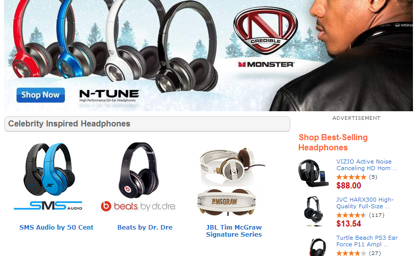
At Walmart.com, product recommendations in the headphones category are based on celebrity endorsements for the brands. Motivated shoppers can still click the most popular products as well.
To sum up, recommended products are important because you shouldn’t place all the responsibility for making the selection on your customer. Solution-seeking and browsing visitors will be grateful if you help them make a decision by offering specific suggestions. You will also be grateful because this way, you can convert some shoppers who otherwise would have dropped out of the process due to their indecision to make a purchase.
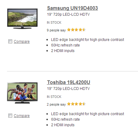
Another advanced way to use product recommendation is to show visitors all the products they have recently viewed. Standard practice is to list the last three to four products. This can be useful for two reasons:
- It serves as a navigation tool: Your customers don’t have to go through the category menu or go through their browsing history to look at the details of a previously viewed product.
- Products that your customers have already viewed should be recommended because your customers are obviously interested in them. Of course you cannot know if they looked at the other products just for comparison, and whether this list will include the product that is best suited for them.
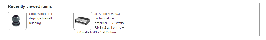
As shown here, Crutchfield.com's list of recently viewed items is located at the bottom of the page, but it can be placed on the side column of the list. The bottom line is to always place it in the same position, but not where it has more importance the actual products being viewed.
4.2. Product comparison
It’s a natural process for your customers to compare products while browsing and evaluate which one best fits their needs based on the qualities that are most important to them. This behavior is true mostly for solution-seeking customers, who try to find the right product for their existing problem.
This form of comparison is simple when you have little product information, because you display the attributes that are important to shoppers on the product list page. However, if you have a product range with a lot of information about these attributes, and any of them could be important, then you may not be able to ensure that you are displaying what the shopper wants to see. This is when product comparison is helpful to guide your customers to make a decision.
Product comparison starts when a customer selects several products for comparison. Typically the comparison is limited to four products, because this is the maximum number that can be compared in a useful way. The selected products are gathered in a list or visible “drawer” on the site, or highlighted as the chosen products for comparison.
When your customer is ready to compare the products selected, they click a button. Then the product information for each product is listed in a scrollable table with a column for each product and with product information aligning in rows for easy comparison. A common approach here is to emphasize the quantitatively best features in specific rows by using bold text. Another common feature is to let the system hide rows that are the same for all compared products, showing only the differences between products.
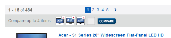
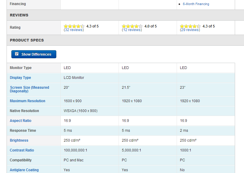
Here we can see BestBuy.com’s product comparison in action. While not visible in the screenshot, primary product features and an “Add to cart” appear at the top and the bottom as well. This way customers can purchase directly from the comparison page.
Crutchfield.com’s comparison function is a not-so-perfect solution. While selecting products for comparison, we can’t see which products are already selected, and it is not obvious how to start the comparison. It’s important when adding a comparison feature to apply general design principles and make it easy to find and use.
4.3. Education and support
One question you should be always asking yourself: “How can I best support my customers in their selection process?”
There can be several good answers to these questions, sometimes as simple as the following:

Crutchfield.com provides live support for every category. They emphasize this message in a clear note at the top left of the page.
One of the most effective ways of supporting your customers is educating them. Teach them about your products and how can they choose among your products. Your customers are usually not familiar with your products, and are very grateful for any help given to them.
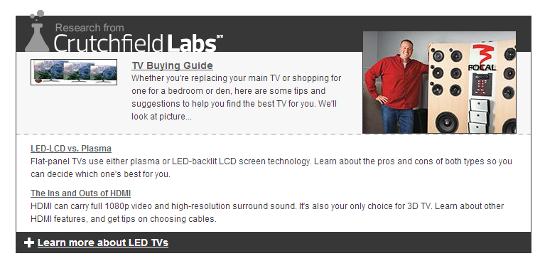
Crutchfield.com is again a good example: they provide education material for every main product category.
After putting the basic selection support for your customers in place including well designed category pages with sensible filtering and search, using these advanced tactics can help your customers make their selection easier.