The Ultimate Guide to Ecommerce Website Design - Chapter5
The Ultimate Guide to
Ecommerce Website Design
5Use of colors
Colors play an important part in the design of every ecommerce website. They have an emotional impact on your visitors, and this emotional impact influences their decision to purchase. Considering general conventions of ecommerce website design, we want to select the color of specific side elements in order to provide the content with a clear and transparent frame. We also want to choose colors that induce emotions effectively and at the right place.
Before a short description of colors, it’s worth looking at a few points regarding their usage.
5.1. Use fewer colors
As with all things in ecommerce website design, keep everything simple and clear, less is more. Don’t use too many colors in the design of your site. The use of too many, roughly five or more, makes the appearance of your website hard to absorb.
5.2. Pair colors effectively
There are colors that, when paired, work in harmony, these are complementary colors. Other colors used together generate a strong effect, these are known as color pairs. It’s definitely worth using neutral or cold colors as complementary color pairs in the navigation of your ecommerce website.
Strong color pairs are best used in banners, but use them carefully. Too many loud elements confuse and discourage visitors. You can obviously deviate from this course depending on particular audiences, but this should only be done after market research and testing of the design to make sure you’ve got it right.
5.3. Be careful with colors
There are established practices in relation to which colors go well together. Our personal opinion is to follow these when designing a usable store, and leave the experimentation to graphic designers' portfolio pages.
In general for ecommerce design you can say that page frames are defined with neutral and cold colors, and warmer colors are used on the elements that are supposed to grab attention.
Now that we’ve looked at some of the conventions for using color in the design of an ecommerce website, let’s take a look at some of the psychological and emotional effects suggested for these colors in Western culture.
5.4. Neutral colors
5.4.1. Black
Black is the color of rugged elegance. However, because it’s a very strong color, care must be taken not to overuse it, as it can radiate arrogance, and may be unpleasant on the eyes. It’s worth using it as a secondary color. In the case of a black background, do not use white text, instead use a shade of grey, which is softer on the eyes.
5.4.2. Grey
Grey is the color of neutrality, humility and respect, but it’s worth avoiding if the elderly are part of your audience. It may trigger feelings of getting old, depression, and even thoughts of death in the elderly. Grey is a good secondary or complementary color and also good for showing the breadcrumbs or pathway below the header in a subtle way.
5.4.3. White
White is the color of serenity, safety, and the most often used color in the field of web design. Most website backgrounds are still white. And there’s a good reason why. Site elements can be greatly emphasized when you leave a good amount of empty area or “white space” around them. Elements also pop naturally on a white background without using flashy colors or color combinations. One side note for exporters and international sellers, white is the color of grief in some Eastern cultures.
5.4.4. Brown
Brown is the color of the earth, and it indicates reliability and stability. It’s a natural, organic color. The color brown triggers feelings of trust and friendliness in people. Its dark shades are often used as a complementary color, but a beige shade can easily be used as a background for any ecommerce website.

5.5. Cold colors
5.5.1. Blue
No wonder a significant number of companies targeting corporate markets use the color blue as the backbone of their web presence. Blue is the color of reliability, calmness, and professionalism, although its different shades carry numerous sub-meanings.
Walmart uses a warmer shade of blue, which triggers greater emotional effects. A light baby-blue color carries a feeling of innocence and feeling carefree, which is why it’s often used for baby products. Turquoise shades are identified with naturalism, freshness, and healthiness.

5.5.2. Green
Green is the color of nature, health, youth, luck, and money. Green is used for the background color on call to action buttons, such as the “Add to cart” button, because it carries evidently positive meanings and inspires activity. The darker shades of green are identified with more conservative emotions. Lighter shades of green can also prove effective as the background of other elements.
5.5.3. Purple
Purple is the color of spirituality, creativity, luxury, and well being. It’s the “strongest” of the cold colors. Because purple can trigger a feeling of secrecy, it’s often used as a complementary color. Nowadays purple is very fashionable, so it appears frequently on clothing websites. The emotional effect triggered by purple decreases in direct proportion to the darkening of its shades.
5.6. Warm colors
5.6.1. Red
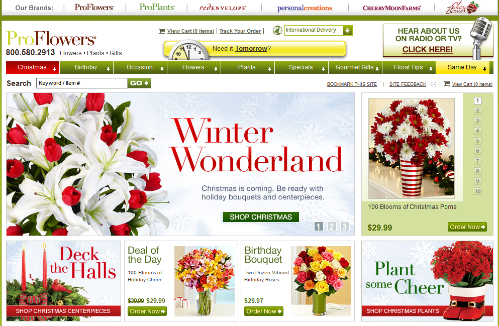
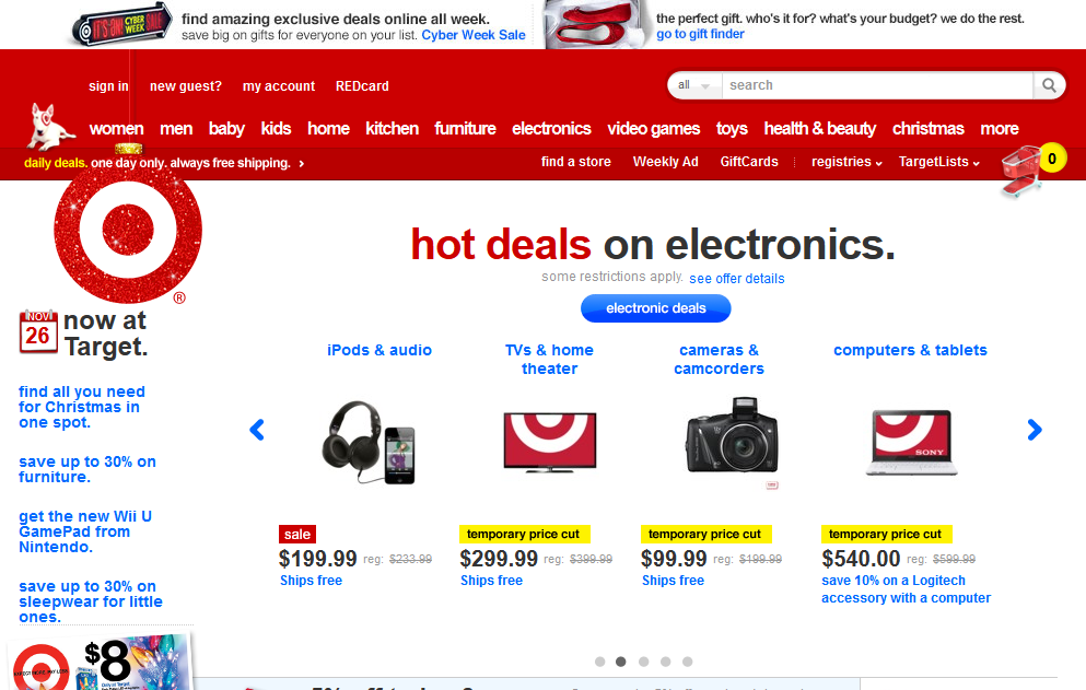
Red is an extremely powerful color that’s been shown in research to increase people’s blood pressure and breathing rate. It has a stimulating effect, and it triggers intense emotions relating to love, sex, passion, and ambition. Target is one example of a brand that relies on red to trigger an emotional association with their products.
5.6.2. Yellow
Yellow is the color of sunshine and optimism. Deeper shades of yellow, such as gold, trigger feelings of richness, but lighter shades can trigger a feeling of weakness or cowardice. Yellow is a very powerful color that can stimulate creativity. Yellow is best used as a complementary color on call to action buttons and other highlighted elements. However, it can be harmful in large amounts. In addition, yellow is the hardest color to process for the human eye, so from a usability aspect, it is not recommended as the primary color for a website design.
5.6.3. Pink
Pink is the color of true love, relationships, and femininity. It has a nice relaxing effect, but should only be used for appropriate audiences. Pink is very strong as a primary color, as are all warm colors, so only use it if you are sure your visitors will react positively to it.
5.6.4. Orange
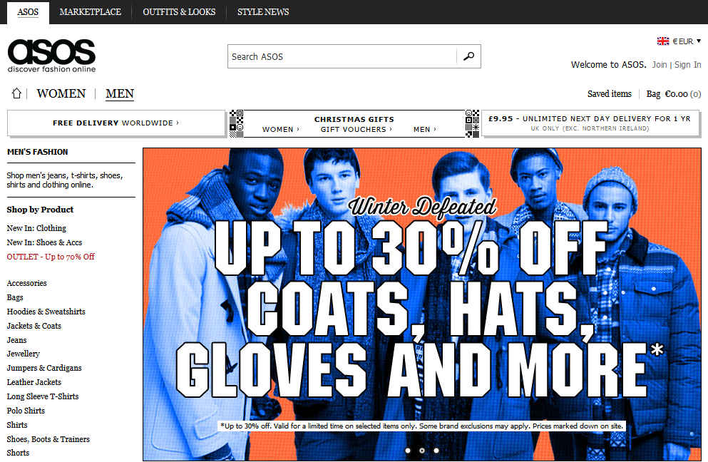
Orange is the color of balance, energy and enthusiasm. It carries the advantages of red and yellow, mixing the emotional charge of red with the soothing effect of yellow. This may be the reason why a relatively large number of websites are based on the color orange, but even more use it in a secondary role. Amazon.com is a famous example of a site designed using orange as one of the colors.
When you choose the colors for your ecommerce website carefully, you’ll improve the usability of your site and find that your visitors stay longer and make more purchases. Another reminder here, to make the best use of color in your ecommerce website design, research your audience to make sure the color choices for your site are correct.
Summary
Ecommerce website design is all about keeping things clear and simple. Using the conventions of website design and form building, you can provide an experience that your customers expect when they visit any online store.
Responsive and adaptive designs are the latest way to make sure your website looks good across all devices and screen sizes. With more traffic on mobile these days, your online store has got to look good and work well for people on the go.
Making sure your product descriptions are as crisp as the contrast on the sans-serif font you choose will put you a step ahead of the competition. By choosing the right brand colors for your audience, you’ll give your ecommerce website the best chance for success.
We hope you’ve enjoyed The Ultimate Guide to Ecommerce Website Design, and while you may not be able to put everything you’ve learned to work right away, implementing some of the lessons here will start to improve your sales.
And that’s the bottom line for ecommerce design. While everyone has their own definition of “beauty”, a beautiful ecommerce website is simple, clear, actionable, and catered to the products it carries and the audience that visits the site.