The Ultimate Guide to Ecommerce Website Design - Chapter4
The Ultimate Guide to
Ecommerce Website Design
4Usability
Making your site easy to use is one of the most important parts of ecommerce website design. The less someone has to think while using your site, and the less your site operates in unexpected ways, the more usable it is.
To put it another way, when someone looks at your website or any of its elements at first glance, their purpose and function should be clear. Don’t make your visitors question the intent of a specific menu item, button, image, or even your entire website. Overall, the design of your ecommerce website should make it clear what your company offers and what your site is all about. This is especially the case now that more people are accessing the web on the go on their smartphone.
A website that is frustrating to use lessens the customer experience, and can discourage potential buyers. You’ve got to provide fantastic offers and communicate them well and also make sure your site is easy to navigate and use so your customers can take advantage of your deals.
4.1. Conventions for ecommerce design
Now that you’ve got a good handle of what usability is, let’s see how design can make your ecommerce website more usable.
When designing ecommerce websites for usability, the first thing to consider is that people visiting your site have visited other sites on the Internet. They will have seen numerous websites, probably even several online stores, and their approach to your website will be based on their previous experiences.
This is the reason we find the same solutions on most websites. These solutions become accepted, and the average Internet user knows and understands them. These widespread accepted solutions are collectively known as conventions. By definition, “conventions” or “standard conventions” are the way something is typically done within a specific field or industry. Here, our focus is on websites, and ecommerce websites – the standard layout of elements on an ecommerce website and how they behave when a person is visiting your site.
Visitors bring an expectation from their previous experience that certain elements on your site will appear in certain places and will behave in certain ways. Here are some conventions that visitors expect to be followed in ecommerce website design.
- The category menu should always be at the top or on the left hand side.
- The Account or Administration menu items should always be at the top or on the right hand side.
- The logo should be placed in the top left, always clickable, and should take the visitor to the home page.
- The search field should always be at the top, in the header, or directly under the logo.
- Only use underline for a link that can be clicked.
4.2. Clearly present site elements
One of the easiest ways to make your site more usable is to communicate the logical structure of your site by clearly presenting the site elements in your layout. Follow conventions for the locations of your elements, group like elements together, and provide clear headings with enough space to distinguish between different elements.
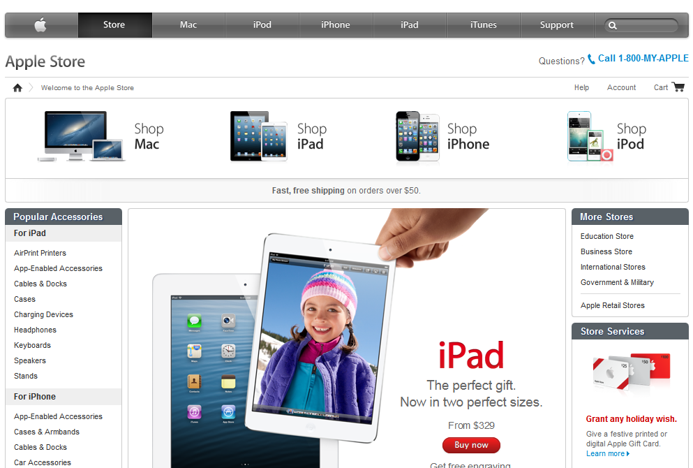
The main page for the Apple Store on their website is an excellent example of clear presentation of elements in ecommerce website design. We see clear headings in a contrasting color, frames that indicate the connection of certain elements, and the top menu bar provides the positioning of the store page within the larger Apple website.
4.3. Clarify what can be tapped and clicked
Tapping and clicking is the primary means of interaction for people using the Internet. When someone is looking to take an action on your site, they are looking for something to click or tap on, whether it is a detailed description of a product, a button to add products to a cart, or a link to customer support.
To make your ecommerce website more usable, it’s helpful to clarify what can be clicked. To make it obvious what features can be clicked, use buttons, underlines, and contrasting colors.
Typically buttons complete an action that takes you towards a next step in a series of actions, or to the next page. Underlined links are the most typical links and can be used for everything, including linking to outside websites. Contrasting colors are helpful when you want to show that an area of text is clickable, blue is the standard convention here.
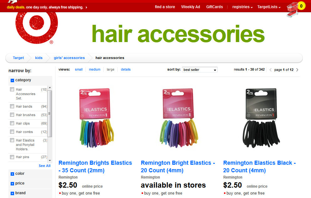
The Target.com site makes it clear what elements can be clicked. Despite the site's dynamic red color, the chose a blue link color. In fact, although it is not evident from this example, all images on the site can be clicked. They paid little or no attention to the hover effect of links where they deviated from this convention. However, in this case they used underlining, which is the other convention indicating a link.
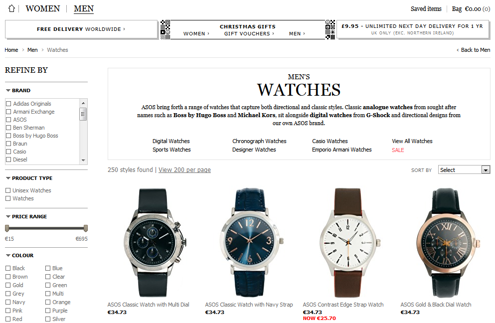
The situation is not as good at the Asos.com site. The color of the links is the same as the text, and we only get an underline effect when we move the cursor over them. This means that clickable items are not clearly distinguishable, and the visitor can only guess about how to interact.
4.4. Avoid “noisy” site design
One of the greatest enemies of ecommerce site usability is when a site is full of elements that are too powerful and attract attention away from the product or the action a visitor needs to take to make a purchase. If you place too many offers, too many flashy, eye catching images, words, and boxes, your visitors will not be able to quickly decide what action to take. Here’s another example where a simple approach is important. When your visitors hesitate because there are too many distractions and they are trying to think about what to do next, they lose momentum and you lose sales.
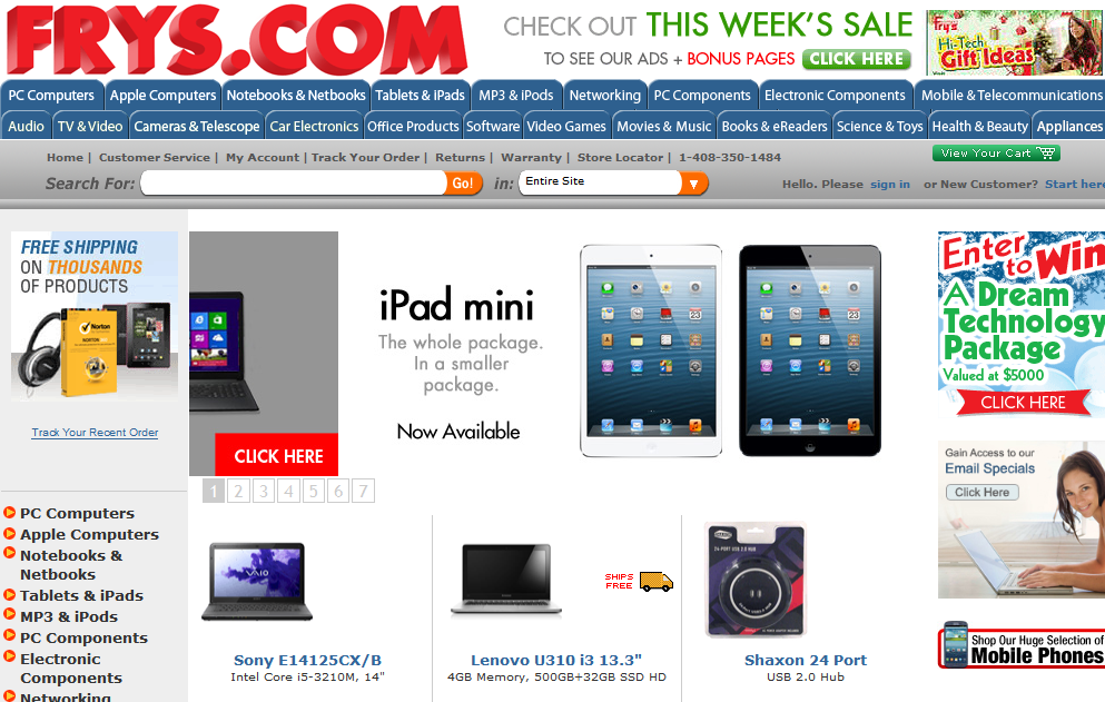
A good example of a noisy site is the frys.com homepage. It is noisy and overcrowded, as almost every element on the page is trying to grab the visitor’s attention.
4.5. Build an effective navigation system
Making your ecommerce website easy to navigate will go a long way to improving usability. What constitutes an effective navigation system? We’ve spoken a little about what elements the header of a website should have. For ecommerce websites, the navigation is typically in the header and the side columns, with additional clues to location sometimes provided in the content areas.
As a general rule of thumb, a good navigation system is one that answers the following questions, whatever the circumstance:
- What online store am I in? (Logo)
- What page am I on? (Page title)
- What are the main parts of the website? (Main categories, menu items)
- What available choices do I have in my current position? (Display current category level)
- Where am I within the site? (Path, current category, emphasize main category)
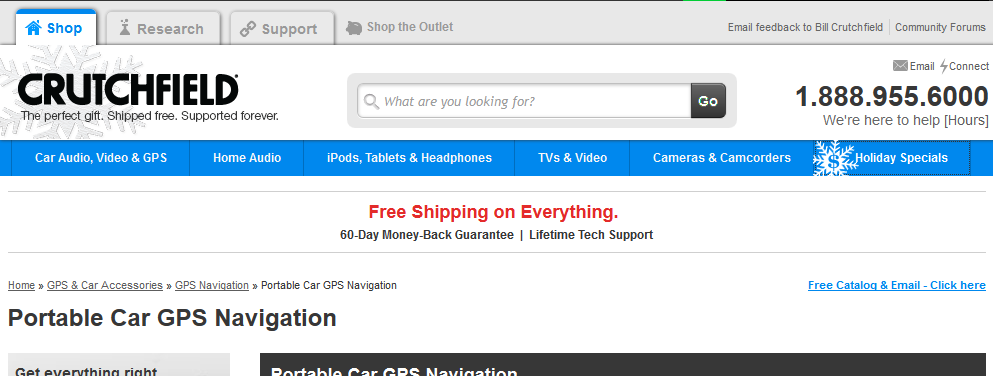
Crutchfield's header almost gets the job done. The site can be divided into three main parts: products, research, and customer support. The header indicates which part of the site you are in. In the content area there are “breadcrumbs” or a “pathway” that show which main category and subcategory you are in.
The “pathway” or “breadcrumbs” are another way to indicate where someone is on your ecommerce website without trying to stuff all the information in the header. This helps keep the header “thin” which makes for a cleaner design.
Typically found below the header on the left, the pathway is a small amount of text indicating how you can reach or have reached a specific page from the homepage. This is website element is also called breadcrumbs, because, like the famous nursery tale, Hansel and Gretel, the pathway displays a trail that shows you the way home!
You can see the page you are on and its position within the structure of the site, and you can also see how deep the page is within the hierarchy of the site, and along which path. This tells you, for instance, what category a product might be in, or the month that a blog post or article was written. On the Crutchfield page shown above, the pathway to Portable Car GPS Navigation is Home>>GPS & Car Accessories>>GPS Navigation>>Portable Car GPS Navigation.

Here’s an example of a stylized pathway, a very simple and usable solution, clearly comprehensible, and most of the link conventions fit. It would work even better if they used underline.
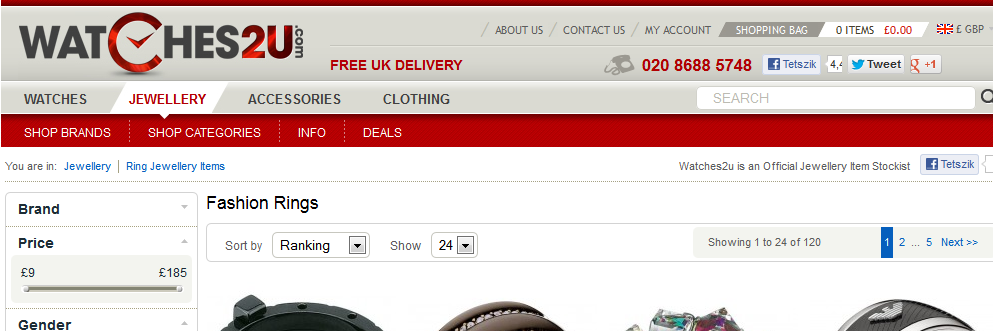
Here’s an example where unclear navigation can make a site less usable. There are a couple of challenges facing the Watches2u.com menu. It graphically indicates the main part of the site, but this selection is not pronounced enough because the highlight color does not stand out. The other problem, in contrast to Crutchfield’s, is that selecting the main part also selects the product group, which should definitely appear in the pathway, but it does not. Incidentally, the design of the other parts is exemplary and worth taking a look at.
4.6. Typography and formatting of text
One of the important parts of ecommerce website design is to use clear and engaging visuals that draw people’s attention without overwhelming or distracting them. However, your ecommerce website also needs text to provide product descriptions, categories, purchase or shipping information, frequently asked questions, terms, and more. To make your site more usable, the presentation of the text should be as clear as the content.
Thanks to technologies like Google webfonts and Typekit, there are more fonts to choose from on the web these days. You can also choose font size, weight, and color – all of these fall under what’s known as typography. How you space the different lines and blocks of text relative to each other is known as formatting. Let’s learn how making the text on your website easier to “digest” for your visitors will make your ecommerce website more usable and help you make more sales.
4.6.1. Compose clearly without using unnecessary words
When you write for your ecommerce website it’s important to not to use phrases visitors may not understand, such as technical jargon, unless of course your audience are experts who will readily understand it.
Use simple and easy to understand words. For example, to emphasize the qualities of a TV, “a TV offers gorgeous, high contrast images, with vivid colors”. Keep “contrast ratio” and similar phrases for the technical specifications section.
Another helpful rule is to get rid of unnecessary words that increase the noise level of a page. They increase the amount of text and this reduces the ease of quickly scanning the page. Concentrate on getting to the point and your visitors will appreciate it.
4.6.2. Simple sentences
When possible, don’t write copious, grammatically complex sentences. As needed, break complex sentences apart into smaller, simpler sentences. To keep a nice rhythm and flow, it helps to vary sentence length, so don’t make you sentences too short.
So how long should a sentence be on a webpage? Though there are no strict rules regarding this, care must be taken that the length of a line of text does not exceed approximately 60 characters. This makes the text transparent and easy to scan, what’s known as “running” or a presentation of text that carries “momentum” for your visitors.
4.6.3. Alignment, line spacing, and paragraphs
There are some formatting conventions that make text more readable and will make your ecommerce website more usable. In particular, text in online stores should be left aligned, because justified text on the web is hard to read, and generally impairs readability. Text presented on a screen also requires more line spacing, typically 1.5 lines instead of 1 line of spacing.
Using separate paragraphs is another way to break up text on your ecommerce website and make it easier to digest. Never present big blocks of text to readers in one piece. Individual paragraphs should be no more than five or six lines. Don’t indent the first row of paragraphs as you would in a printed document, and provide adequate space between paragraphs.
4.6.4. Headings or highlights
For longer pieces of content, it helps to insert some headings into the content to identify sections and inform people where they are in the piece. In the case of a really long text, it is worth placing a table of contents section at the beginning, where links point to the different chapter titles.
Another method to increase the readability and continuity of long text on the Internet is to highlight important words or phrases. This is typically done with bold treatment on the font or a contrasting background color. This is a great way to help visitors focus on key points, especially in product descriptions.
When highlighting text or using headings, make sure to follow the conventions regarding clearly identifying links so your font treatment isn’t confused as a link. As a reminder, never use underline to emphasize unless it’s a clickable element, and if possible avoid italics as well, because they are harder to read.
4.6.5. Web font for the web
For longer texts, always use sans-serif fonts. Some examples of sans-serif fonts in current use on the web are Verdana, Arial, Helvetica, and Lucida. Serif fonts such as Times New Roman and Georgia should be reserved for titles and headings.
4.6.6. Web font for the web
Readability and usability go hand in hand when it comes to text. When someone can’t read the text, it isn’t very usable! With more people using mobile devices for the Internet, often in varying lighting conditions, it’s vital that text has sufficient contrast to be readable.
The most straightforward way to achieve this is to use light colors for the background, and dark colors for text color. The opposite approach to achieve contrast is a light colored font on a dark background. However, dark colors on light backgrounds are easier to read and screens are tuned to present text this way.
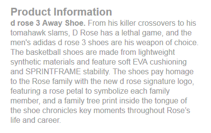
The content of the Adidas.com product descriptions are fairly good, however the text color is possibly a little too light. The concentration of text could also be reduced by increasing the line spacing and breaking it up into two paragraphs.
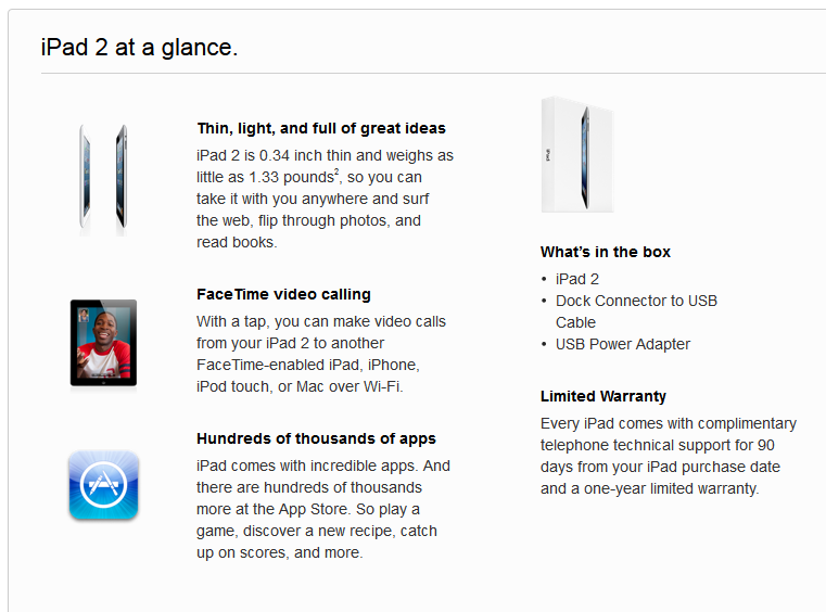
Apple.com offers a good example of text treatment in their product description for the iPad 2. There’s plenty of room for the text to breathe with good line spacing and space between the different blocks of text, the headings are bold but the spacing indicates they are clearly not links. The slightly lighter font color shows you which part is the content, without losing too much contrast. We also see bullet points to quickly state what’s included with the purchase.
4.7. Form usability
Forms are of particular concern for ecommerce websites when it comes to designing a site that is more usable. Visitors to your site fill out registration forms and sign up forms for your newsletters, and shoppers fill out forms when they buy your products.
Knowing the basics of form usability will help your visitors and shoppers have the best experience when they are entering information on your site. As with general ecommerce website design principles, there are conventions for forms that people expect. Keeping your forms standard, simple, and clean is the best way to keep your customers happy.
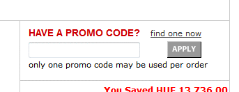
When you think about forms, it might even mean really small ones. For example, this is the Macys.com coupon entry field from their cart page. The sizing and arrangement of text is good, but the Apply button could be closer to the input field.
4.7.1. Form elements
Knowing the basic form elements is the first step to understanding ecommerce website form design. Here are some basic form elements that you’ll find on nearly every ecommerce website:
- Labels: Names or titles of form fields that help customers identify the information they need to enter.
- Help: Usually the short text under the form field or label, which helps to identify the type, format, role, or importance of data to be entered. If it’s not evident, for example, in the case of a phone number, a line of text might be placed under the field which reads: “Please enter a number you can be reached at anytime”. Many standard fields don’t need this when you use clear labels.
- Input fields: The specific fields where information is input or options are selected. These are not always text fields, but can be dropdown menus, check boxes, and radio buttons.
- Actions: Buttons that send data to the store when clicked.
- Messages: Form feedback for a customer about the results of their activities. For example, entering a ZIP code calculates shipping fees, or if there are any problems in an input field, for example, the e-mail address is already taken.
- Validation: Determines whether the format of the entered data is correct or not, and notifies the user about the result. It can appear as a follow-up error message, or immediately in real time, which is preferred.
4.7.2. Design for forms
Label placement
There are constant arguments about whether to place labels next to or above input fields. If labels are next to the fields, visitors' eyes must follow a gradual path, whereas if labels are above the fields, they can process the form data in a linear way, which requires less effort.
If you decide to go with the first option, always left-align labels next to the form fields so which field they identify is clear.
Indicate required fields
The most common indicator for a required field is the asterisk (*) character. But, it’s even better if you also clearly define optional fields by using the words “optional” or “not required” as placeholder text, or in the help text below the field.
Error messages should be evident and clear
It’s important that any error messages that have some use to a visitor are made clear. For example, if an email a visitor wants to use has already been registered, display the message, “This e-mail address has already been registered”, instead of the more technical error, “This identifier is not available”.
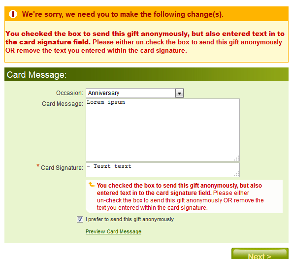
At Proflowers.com, they provide feedback during their purchase process. However, the message is only displayed after the “Next” button is pressed. The warning is evident and effective, but too loud and unnecessary. A better solution would be to clear the selection and confirm that this was acceptable afterwards, or provide immediate feedback on the error.
Use immediate feedback
Immediate feedback messages in forms provide more usability than waiting to process the form and then telling your customer there is an error. Use auto-validation with immediate feedback messages in place to help your visitors complete forms without having to type everything in twice. You can use it for phone, email, and zip code fields, amongst others. However, don’t over-use this function, or use it too early or too aggressively, as it can cause confusion and annoyance.
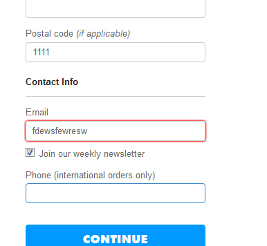
At threadless.com, the highlight a field with an error with a red frame, however it’s not clear what was wrong with the input.
Visually differentiate the active field
Using a thicker border or different color border or background to highlight the active field in a form. This way a visitor knows at a glance where they are in the form.
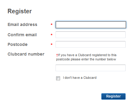
Although this form does not provide immediate feedback and the action button could be more natural, in a position more in line with the eye, it does indicate the current and required fields excellently.
Make action buttons clear
People want to know exactly what will happen when they click on a button. Having clear action buttons eliminates the guesswork for your customers. Some typical action buttons include: “Redeem coupon”, “Continue to checkout”, “Place order”, or “Sign up”.
Don’t use long and complex fields
For any non standard information you are collecting with precise rules, it’s worth creating smaller, separate fields to make it easier to enter the information correctly. Of course, don’t overdo it; this isn’t necessary for standard information like phone numbers.
While checking for errors, also be tolerant
While it’s great to have a form that provides immediate feedback about errors and a good error-checking system, make sure the errors you are checking are worth the additional message to your customer. For instance, the form can be made to automatically remove unsupported characters. Accepting more types of input and then providing confirmation can keep the process moving forward for your visitors who are completing a form.
Avoid long lists
If an item has to be selected from a list in a form, you can use dropdown menus and radio buttons. When you have more than 7 items in a list, it’s better to use a dropdown menu. When there are multiple selections for more than 7 items, it's best to have an element that automatically assigns those options as you choose them from the list.
Match the design of your ecommerce website and brand
When you design forms for your ecommerce website, you want to follow all the conventions above to make a usable experience for your customers. Don’t forget to add some basic styling with one or two color elements or a small logo tastefully placed to indicate the form is part of your site.
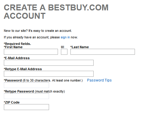
Surprisingly, this example of BestBuy.com’s registration form does not match the quality of the store's other elements. While the form follows most conventions well, it’s not clear that it’s the same brand, other than the name.