The Ultimate Guide to Ecommerce Category Pages - Chapter3
The Ultimate Guide to
Ecommerce Category Pages
3Narrowing down the product range
Possibly the most important, and at the same time one of the most basic methods of selection support, is to offer your customers the ability to narrow down your product range to a manageable quantity according to their own logic. Your goal is to help them reduce the number of items they are viewing to make it easier to decide which product to purchase. We’ve already looked at the optimal number of products, typically less than 50 per page, but at least 10 products.
The most important tools of narrowing down are categorization, filtering, and search. Filtering begins on the home page. This is where your customer makes their first decision, by choosing a category page, or a direct link to a product page. Your category pages handle any filtering or selection after the home page. Most sites should have a search box located in the top bar with suggested results to help customers find what they need fast. Let’s see how each type of narrowing down works.
3.1. Categorization
First there is categorization, the simple grouping of products. You divide your products into smaller groups according to certain criteria, and name these groups, which will be your category names. Then you can create smaller groups within the groups, and these will be your sub-categories.
If you divide your products into a certain number of categories but do not divide these categories any further, then you have single-level categorization. If you divide the categories into sub-categories, then you have double-level categorization, and so on, each division indicating an additional level.
Single-level categorization
If you have a bookshop, it may be best to categorize books primarily according to content, such as “Business” and “Literature”.
Double-level categorization
In a lot of situations, single-level categorization is not enough. In a bookshop there are often several hundred business books, which are worth dividing into additional topics.
By dividing your products into smaller categories, you provide a more manageable number of products for your customers. You might wonder how many categories should be created and how deep the category tree should go. Research shows that five to nine categories per level are optimal.
When your category tree has more than 15 categories per level, it’s best to display these categories alphabetically, because this greatly facilitates selection among them, especially for the determined and solution-seeking customer groups. This is also makes sense in most instance of ten or more categories, unless there is some serious reason against alphabetical sorting.
Category depth no greater than two or three levels at most is optimal, meaning you can reach a product list that includes the products you are looking for with, at most, three clicks.
Of course, these rules only apply to a specific number of products. As the number of products increases, you have to increase something: either the number of categories per level, or the category tree depth.
3.2. Categorization types
A single product range can be categorized according to a number of factors. However, many online stores categorize their products following only one way of logic. By doing so, they may lose a large number of customers who could not find the product category appropriate for them.
How well you have defined your customer groups and how much you understand their way of thinking thus becomes really significant. The following questions should be asked for all your important customer groups:
- If I were part of the specific customer group, how would I select from these products?
- How can I narrow down the number of products to a manageable level?
- What questions will I have?
- Could I find the products most appropriate for me according to these categories?
Often, categorization for your customer has nothing to do with “official” categorization, as in how you purchase from wholesale. For example, in the case of books, while a book seller may purchase based on publisher, people searching for books are more likely to search based on topic so using the publisher for categorization wouldn’t be very helpful.
You’ll likely find that different customer types think differently and select differently, so you need categorization based on different logic types. This is referred to as parallel categorization. This is a process whereby you categorize your products in multiple categories based on different logic. As result, some products will appear “in parallel” across two or more categories.
While this may seem redundant, it allows customers in different customer groups to use their own way of thinking to find the same product and reach the same conclusion: your product is just right for them.
Let’s look at the most common categorization types:
Functional categorization
Functional categorization means grouping the product range according to its “function”, or use-case. Functional categorization is usually the most common categorization it is essential for determined customers. When someone knows exactly what kind of product they need, they will generally use functional categorization.
Some examples:
- Furniture: table, chair, dresser, lamp
- Flower: cut, potted, and within that by type: rose, lily
- Computer: desktop, notebook, component, accessory, software
- Clothing: pants (trousers), t-shirt, skirt, shirt
Target market or demographic categorization
This is when products are grouped according to your customers’ demographic criteria, such as type, sex, age, etc.
Some examples:
- Flower: for wife, mother, friend
- Clothing: men, women, children
- Toys: under the age of 3, 3-8 years, 9-18 years, adults
Application categorization
It may be helpful sometimes to search for products according to where and how the specific product range is used, in other words, where it is applied.
Some examples:
- Furniture: dining room, kitchen, living room, bathroom
- Flowers: birthday, wedding, funeral, anniversary
- Computer: Internet, gaming, business, travel
Solution categorization
There are typical product ranges that offer solutions to specific problems, regardless of what functional category they fall into.
Examples:
- Food supplements: weight loss, weight gain, anti-aging, cellulite
- Medical supplements: diabetes, heart problems, allergies, osteoporosis
Special or specification categorization
Almost all product ranges have specific characteristics by which they can be grouped, and then categorized. Also, there are product ranges where products are typically selected according to these parameters.
Some examples:
- Computer Monitor: categorization by screen size: 15", 17", 19", 20", >20", screen refresh rate: 16ms, 10-16ms, 4-10ms, 2-4ms, 1-2ms, connections: DVI, VGA, DisplayPort
- Flowers: categorization by stem length, quality, origin
- Clothing: categorization by material, washing instructions, color
- Any product range: categorization by price: < $50, $50–$100, $100–$250, brand: Samsung, LG, HP, Dell
The possibilities are endless, and there are as many categories as there are product ranges. This is when being knowledgeable about your products and having previous experience selling them is really important. You must know how your customers make a selection.
In a brick and mortar store, a customer can ask any questions they wanted before purchase. Selling online, you have to take it a step further, and anticipate your customers’ questions in advance. Based on your understanding, you want to make selecting your products as easy as possible without a dedicated salesperson to answer questions at the time of sale.
The existence of clear, logical categorization on your site is enough for determined customers, but the majority of solution-seeking visitors and browsing visitors can be converted to customers when we guide them with some form of logic for selecting a product online.

You can see thoughtful categorization was used in the design of BlueNile.com. Their main categorization is a hybrid of functional and application-based categorization, and a detailed information sub-page is also located in the main category menu.
3.3. Category menus
Category menus provide the links from your home page and other pages to your various categories of products. Category menus should be located in one of the following two positions: either at the top as a horizontal menu, or on the left side as a vertical menu. Placing your category menu somewhere else on your site can be confusing for your visitors.
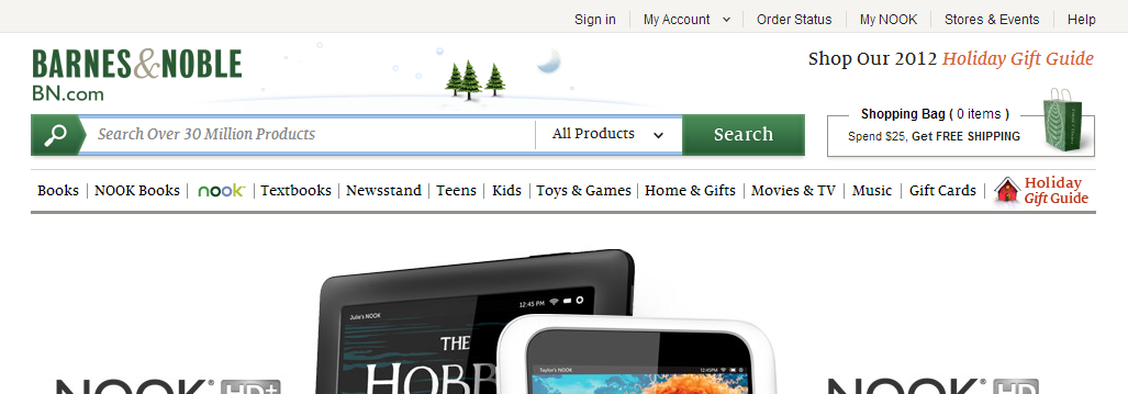
The Barnes&Noble BN.com site has followed its existing tradition from the beginning, and features the main category menu at the top of the site.
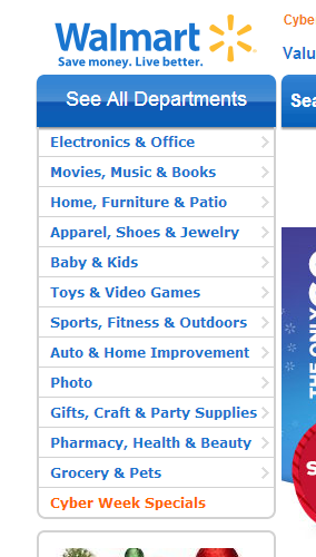
The left-side category menu on the Walmart.com site “disappears” on category and product pages, but can be recalled with a click. Because it’s in a familiar location, visitors know to look for it there.

If you have such a large number of categories such as Amazon, you may hide the category menu altogether, and only show it upon request. However, this can be a very confusing solution for new visitors, so it should be avoided if possible.
3.4. Filtering
Filtering occurs when a product range already narrowed down by categorization can be further narrowed down based on another product characteristic. Most common filtering is based on price, manufacturer, or some other element of the product range, for example: screen size, dress size, or discount products.
Unlike sorting a list, filtering uses options in a side or top menu to narrow down the number of products that are displayed. The filtering can occur independently of the sort order of the products in a list. Let’s look at some examples:
Example #1
You are browsing a site for computer processors and you choose the computer->component->processor category which yields 200 processors in the category. You filter these by brand, let’s say you are only interested in AMD. Then, let’s say you filter them by price to display only processors costing $150-$200.
Example #2
You are browsing a site for flowers for a wedding bouquet, so you select wedding bouquets. Then you filter wedding bouquets to display only those that contain roses. Then you further filter the product list to display only bouquets that cost $75-$100.
Filtering is the highest, most refined level of product selection support. It minimizes the compromise necessary on category pages and, your customers don’t have to make “either-or decisions” to navigate through categories and sub-categories.
You can have an unlimited number of filters with only their display and the existing product characteristics setting the limits. However, it’s best to keep the filters limited to between five and ten in number to keep your customers moving forward with their decision. Some technical sites may have more depending on the specifications of a product range. There are numerous solutions for adding filters to a site. Let’s take a look at a few examples:
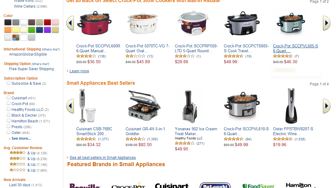
Amazon’s filter is a good example of finding relevant filters under seemingly all conditions. Even in the case of a mixed selection - such as kitchen appliances, it recommends numerous filters: colors, additional categories, manufacturer, free shipping, novelties, discount levels, customer reviews, and, of course, price.
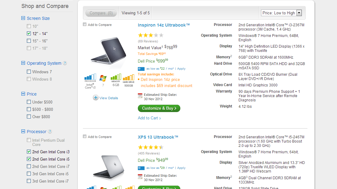
Also, the Dell.com product filter is one of the nicest filter examples. Filtering is extremely simple and logical, and several options can be selected based on specific conditions.
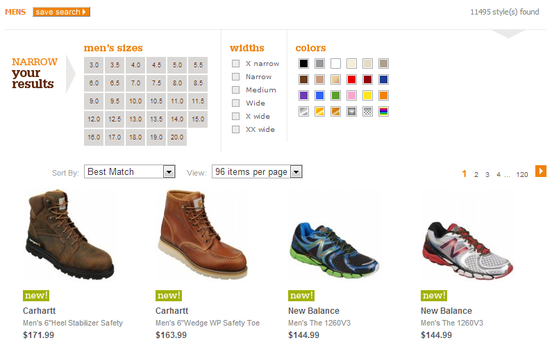
Shoes.com features a very large filter at the top of their page. The solution is not recommended best practice for most sites because the filter takes up a large amount of screen space. However, it appears to make sense for the site because they carry a large number of products with the same characteristics to be filtered.
3.5. Search
The purpose of the search function is similar to that of categorization. The only difference is the method of narrowing down the products. In categorization, a customer makes a set of choices based upon predetermined categories and sub-categories. The customer picks one category, then perhaps a sub-category, and uses filters or sorting to narrow down the set of products step-by-step until they reach the level where they can make a selection.
During a search, however, the customer enters the product or features they are looking for, maybe a word or a sentence, and you narrow down your product list accordingly in one step. The search results page is a lot like a category page. The search results page has the same goal as a category page, for a customer to make their selection from this narrowed-down product list.
Search fields have been created for determined customers, who already know what they want, so they can quickly find it. However, experience shows that a great number of solution-seeking visitors also use search fields, and they search in a different way than determined customers.
3.6. Search types
Search fields operate in two main ways, and most search fields are a “mix” of these two. These include:
Keyword search
During keyword searching, the user is presented with an input field where they can enter any characters or words, and the search function will list the products that include this word in the product title or description.
For example at an online book store, a customer enters “harry potter” into the search field, and the system displays all products that include “harry potter” in the title or description, which will probably be all the Harry Potter books or related materials.

The search function of drugstore.com is a good example of search field design and placement. There is nothing complicated, just an input field labeled “search keyword,” and a clearly visible button with a magnifying glass — presumably, all visitors will understand this.

Amazon’s search field is near perfect. The word “Search” in front of the input field clearly indicates its function, and in the dropdown field, the visitor can immediately narrow down the main categories and the search itself starts with the button labeled “Go”. The only thing that might be missing is the conventional magnifying glass icon.
Filter search
Filter searches guide your customers to search according to different features. This is especially useful when they may not know which products or features of products they should search for. Filter searches provide your customers pre-set values that they choose from to perform their search.
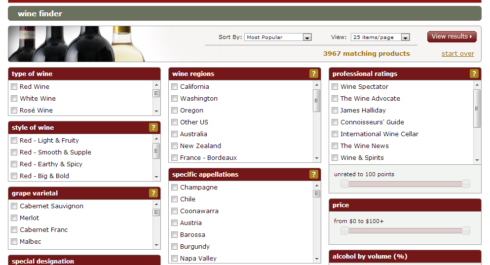
The Wine.com detailed search function is a good example of a filter search. Easily accessible from the home page, all the categories into which the products are sorted are displayed here, and you can simultaneously filter approximately 3,500 products according to all the different choices.
If visitors are looking for a specific product, keyword searching is probably the best solution, searching by the product name, item number, description, or some part of those. It’s best practice to place your search field in a prominent position on your site, and make it available, if possible, from everywhere. It’s not effective to hide it behind a menu item.
Autosuggest search
Autosuggest searches are a type of search technology that will predictively provide search terms or keywords based on the input in the search field. You can also set some of the terms that are emphasized. Because of this, autosuggest searches work well as “recommended searches” for first time customers who may not be familiar with all the products you carry, or the keywords they should use to find the product they need.


