The Ultimate Guide to Ecommerce Website Design - Chapter3
The Ultimate Guide to
Ecommerce Website Design
3Sales are a beautiful thing
We’ve talked about making websites “beautiful”. For ecommerce websites, a clean and simple presentation that allows visitors to easily navigate your site and make a purchase is a beautiful thing. Let’s take a look at some of the ways you can use design to make more sales with your ecommerce website.
3.1. Design for commerce, not for art
One of the most important things to remember is that your website is not merely meant to look good. Do not think of your ecommerce website as a work of art enabling you to express your creativity, but as a means of production. Of course, you want an attractive design, but your site shouldn’t be overly elaborate, difficult to navigate, or distracting to you. All of these things will prevent you from making more sales, and that’s not pretty.
Each page on your site must have its own purpose, and the layout, content, and design elements must all be directed towards these goals. Of course you want your ecommerce website to stick out from your competitors and be memorable, but that’s not the primary goal.
The first rule to good ecommerce website design is to keep things simple. You should always use the smallest number of design elements to beautify the page.
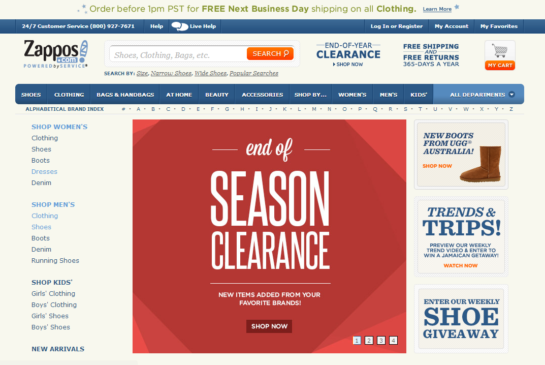
The Zappos.com site is a prime example of a simple and efficient website design. There’s not a great deal of artistic input on the page, yet it’s extremely usable. Whether or not it suits your personal tastes, it’s clear and makes it easy to find what you need without a flashy or overly ornate presentation.
3.2. Design for your products
When you design your ecommerce website, it should be immediately obvious to your visitors what type of products you carry. For an online store that carries a wide range of products you can use a neutral design. However, the more you narrow down the range of products for sale, the more this should be reflected in the design as well.
This also applies to the perceived values of your products. For instance, if the primary selling point of your site is low prices, the page should suggest simplicity and utility, while if your ecommerce website sells quality, expensive, or luxury items, then its design should reflect that instead.
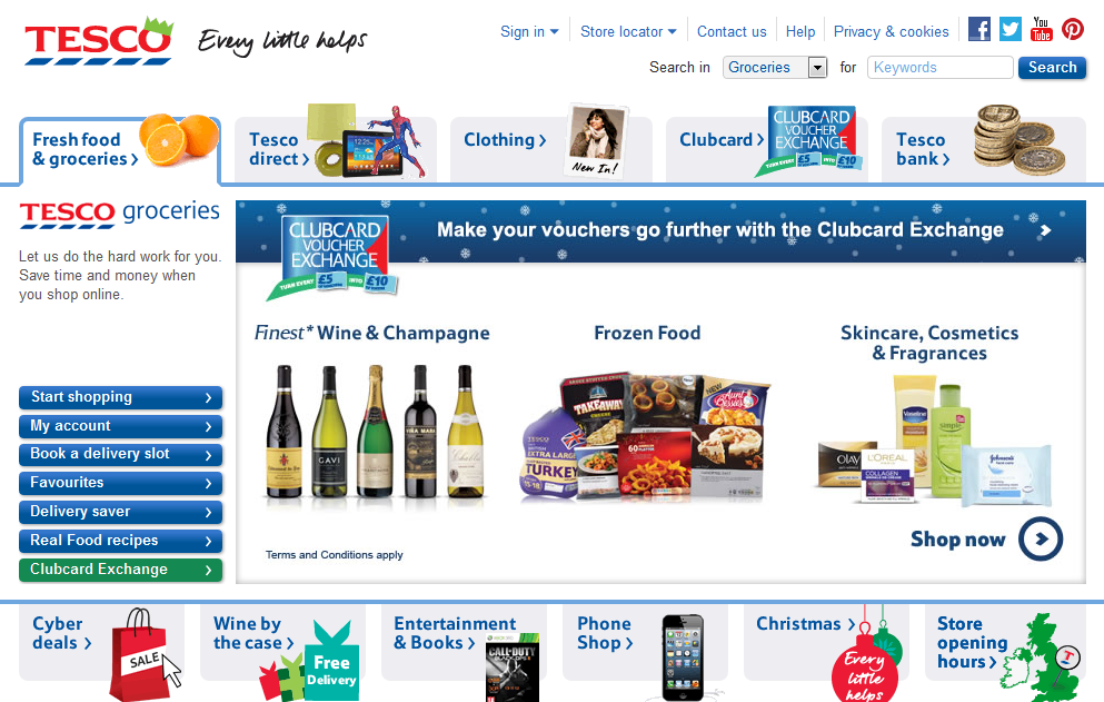
We can’t say that Tesco.com had beauty at the top of their list when they designed their site, yet it is tasteful in its own way. At the bottom, the most used links are given a graphical element to make them easier to identify and overall the navigation is user friendly. The site doesn’t carry the old Tesco stigma of being “cheap” because Tesco has been noticeably repositioning itself in the market lately.
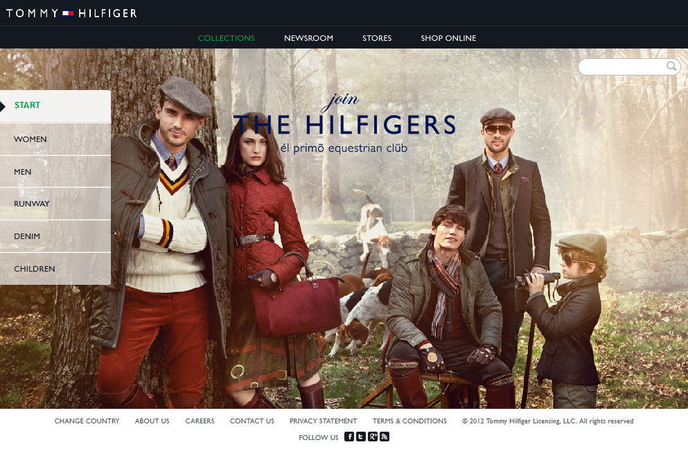
The Tommy Hilfiger site is conservative, suggests quality, and the image clearly reflects product positioning.
3.3. Make it easy to identify your brand
To encourage your buyers to remember you and generate more repeat business, it’s important that your ecommerce website is part of a well-constructed brand image. The previously mentioned Tesco.com homepage is a good example, as the page perfectly fits other generally used visual elements by the brand.
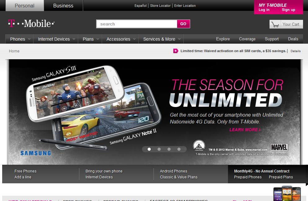
The T-mobile.com site is another example of good branding in an ecommerce website. It features the famous T-Mobile magenta in select places to reinforce the company’s brand image on the website in a tasteful way.
3.4. Build trust and establish authenticity
Poorly made designs can undermine trust in seconds. That’s why so much attention has been given to making sure websites look good across all devices. In general, ecommerce website design should express a feeling of quality. The only exception to this rule is if your unique selling point is being the “extremely low cost” alternative, in which case a design that appears rough or low-class might suit your brand image.
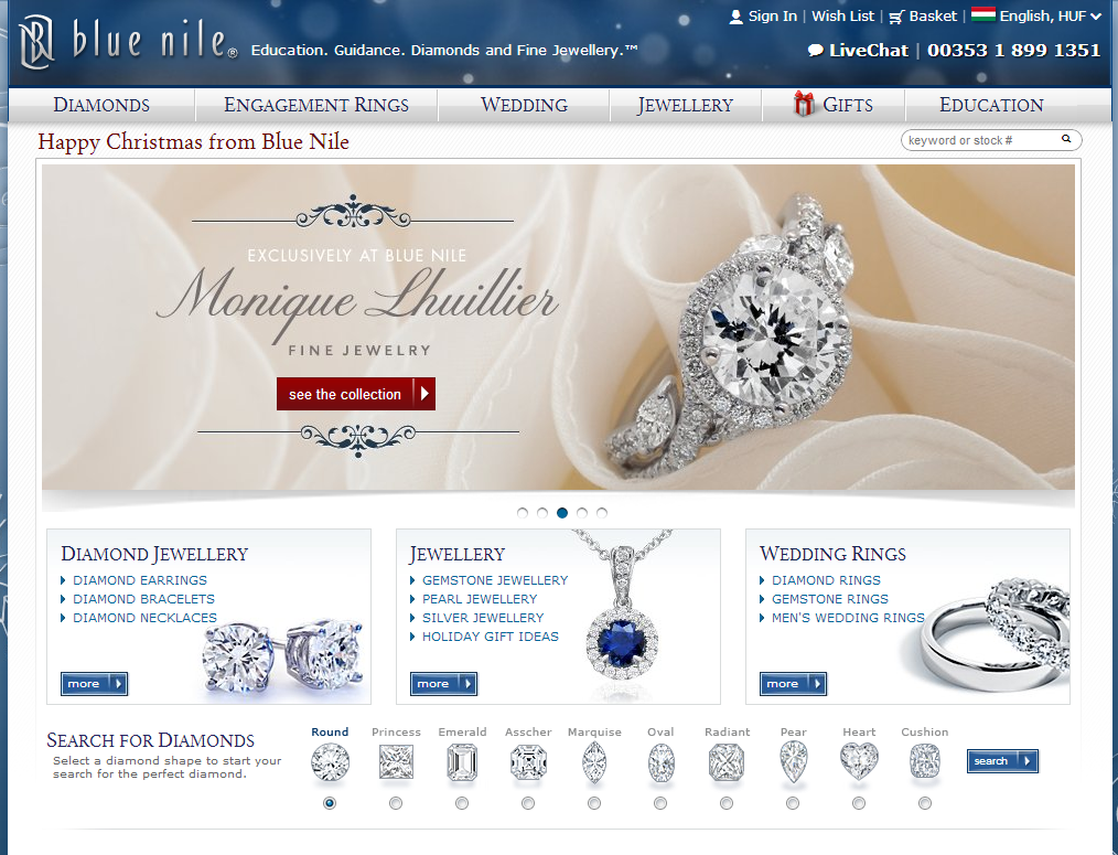
The BlueNile.com site sells diamonds and fine jewelry. These are expensive products. It’s logical that the site design is clean, elegant and extremely credible. It has a classy look and this encourages trust in the visitors.
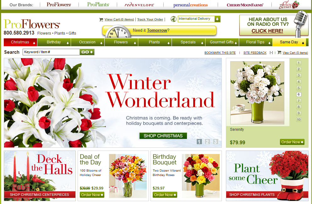
Here, design only provides the framework for Proflowers.com. The products provide the beauty and feel of the site. All other elements provide visual support, navigation, or offer a unique selling point, such as the loud “Need it Tomorrow?” label.
3.5. Design for your audience
The graphical elements and visual appearance of your ecommerce website should fit your audience. A site aimed at a younger audience, for example an online toy store, should be colorful and vivid, while a site targeting a more conservative or older audience should be less flashy, less colorful, and more elegant.
When your primary audience is men, feel free to use colder colors such as blues and grays,. For an audience made up mostly of women, consider using warmer colors such as a deep red or rich shade of brown.
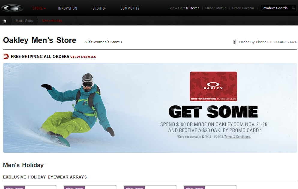
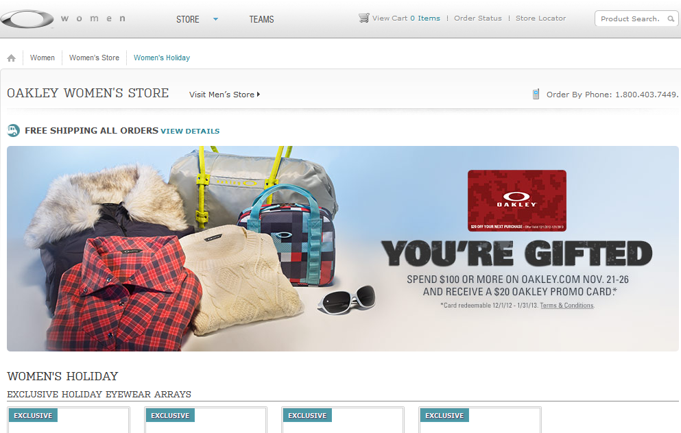
The oakley.com site uses two designs: more black for men and a silver design for women.
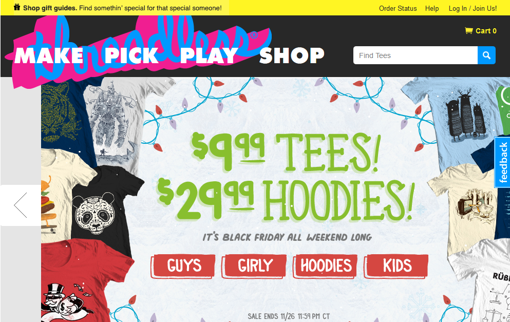
The threadless.com site targets young people, selling crazy designer T-shirts and hoodies, so the loud design is a perfect match for the audience.